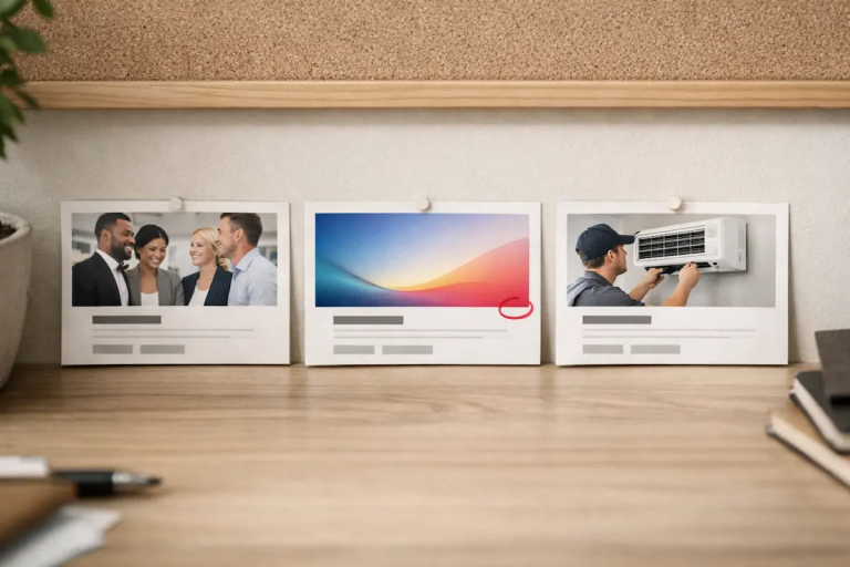
Why Good Photos Fail on Websites When Roles Are Unclear
Why good photos fail on websites is rarely about the photo itself.
The image may be technically sound. The lighting may be clean. The subject may be clear. On its own, the photograph works. And yet, once placed on a website, something feels off. The page loses focus. The message weakens. Credibility softens rather than strengthens.
This disconnect is frustrating precisely because it feels unintuitive. If the image is good, shouldn’t it help?
In practice, that assumption is the problem. Most website image failures are not caused by poor photography. They are caused by misunderstanding what images are required to do once they are placed on a page.
This article looks at why good photos fail on websites, how otherwise strong images end up undermining clarity and trust, and why many common website image mistakes are really judgement problems rather than visual ones.
The core misunderstanding: good photography vs useful photography
Photography is often evaluated in isolation. Websites are not.
A photograph can be successful on its own terms and still fail once it becomes part of a larger system. Websites are systems of hierarchy, pacing, emphasis, and intent. Images are only effective insofar as they support that system.
This is the first gap that causes photos to fail online. People ask whether an image is good, when they should be asking whether it is useful in this context.
On a website, images are rarely decorative by default. Even when they appear decorative, they influence how content is read, how attention moves, and how credibility is perceived. An image that does not actively support those functions can quietly work against them.
This distinction is explored more fully in Photography for Websites: How Images Actually Work on a Page, but the failure usually happens much earlier — at the moment the image is selected.
Why strong images weaken pages instead of strengthening them
One of the most common website image mistakes is assuming that strength is transferable.
An image that worked well:
- on social media
- in a portfolio
- as a standalone photograph
is assumed to work equally well on a website page.
But websites impose different demands. Images are not evaluated for emotional impact alone. They are evaluated for alignment, restraint, and clarity. A visually strong image can overwhelm text, pull attention away from the intended message, or introduce expectations the page cannot fulfil.
When that happens, the image doesn’t fail dramatically. It fails quietly. The page becomes harder to read. The message feels diluted. The reader hesitates without knowing why.
This is how images end up hurting credibility rather than supporting it. Not because they look bad, but because they are doing the wrong kind of work.
Placement turns good photos into bad decisions
Many photos fail online because placement is treated as an afterthought.
That’s one of the most common reasons why good photos fail on websites even when the photography is strong.
The text is written. The layout is assembled. A gap remains. An image is added to fill it.
At that point, the criteria for selection have already shifted. The question is no longer “what image clarifies this section?” It becomes “what image fits here without causing problems?”
Under those conditions, even good photos are miscast. They are asked to lead when they should support. They are asked to support when they are visually dominant. They are placed where they introduce tone instead of reinforcing it.
The image itself hasn’t changed. The role has.
This is why many photos that don’t work online still look perfectly fine when viewed alone. The failure is contextual, not photographic.
When images compete with the page instead of serving it
Another reason good photos fail on websites is competition.
Images compete with:
- headlines
- section structure
- reading flow
- calls to action
When an image competes rather than supports, the page becomes visually noisy. Attention fragments. The reader is forced to decide what matters instead of being guided toward it.
This often happens when images are chosen for visual interest rather than responsibility. The image looks engaging, so it is assumed to add value. In reality, it may be demanding attention without earning it.
Photos that don’t work online often share this trait. They are visually assertive without being structurally helpful.
The page feels heavier, not clearer.
The credibility problem no one notices at first
One of the most damaging outcomes of poor image judgement is gradual credibility erosion.
Images carry implied signals:
- professionalism
- seriousness
- intent
- confidence
When images are misaligned with content, those signals become inconsistent. Nothing breaks outright, but trust softens.
This is particularly common when:
- stock images are used without purpose
- “nice” photos replace specific ones
- images are added simply to avoid empty space
The result is a page that feels generic rather than deliberate. Readers may not consciously identify the problem, but they feel it. The site feels less authoritative, less considered, less reliable.
This is why website image mistakes are rarely about aesthetics alone. They are about perception and expectation.
Why technical optimisation doesn’t fix this
It’s tempting to assume that if images are properly optimised — compressed, responsive, SEO-friendly — the problem is solved.
Technical optimisation matters, but it does not address judgement.
This is a big part of why good photos fail on websites: performance can be perfect while the role is wrong.
Guidance from Google Search Central focuses on making images discoverable, fast, and accessible. Those factors affect performance and usability, but they do not determine whether an image clarifies or confuses.
An image can be technically perfect and still fail its role.
This is where many discussions about image SEO stop short. They focus on how images are delivered, not on whether they should exist in that position at all.
Understanding page experience requires more than speed and metadata. It requires clarity of intent.
Abundance makes poor image decisions easier, not harder
Modern websites rarely suffer from a lack of images. They suffer from excess.
Large libraries and long shoots create the illusion of choice. In practice, abundance increases hesitation. Faced with many competent options, people choose images that feel safe rather than ones that are precise.
This leads to:
- interchangeable visuals
- softened tone
- reduced specificity
The image doesn’t offend, but it doesn’t contribute either.
Photos that don’t work online often arrive through this process. They are chosen not because they solve a problem, but because they avoid one.
Why “nice” images fail most often
“Nice” images are a recurring culprit in website image mistakes.
They are:
- well-lit
- balanced
- pleasant
- easy to accept
They rarely provoke objections. They also rarely do much work.
Nice images tend to smooth over meaning rather than sharpen it. They avoid commitment. On a website, that avoidance reads as vagueness.
When a page relies heavily on nice images, it begins to feel generic. The content may be thoughtful, but the visuals do not reinforce that thoughtfulness. Over time, this disconnect becomes a trust issue.
This problem is explored more directly in Why “Nice Photos” Are Often the Wrong Choice, but the underlying pattern shows up everywhere images are used without clear responsibility.
The hidden cost of images that don’t earn their place
One of the simplest tests of whether a photo works on a website is this:
Would the page change if this image were removed?
If the honest answer is no, the image is not doing meaningful work.
Photos that don’t work online often survive because they are harmless. They fill space. They look fine. Removing them feels unnecessary.
Over time, however, these images accumulate. Pages become heavier. Decisions become harder. Stronger images start to feel out of place because the surrounding visual language has become vague.
This is how standards drift without anyone consciously lowering them.
A quick diagnostic: why this image is failing here
Why good photos fail on websites is repeatable — if you can name the failure, you can correct it. If you can name the failure, you can correct it without endlessly swapping images.
Here are four fast checks that usually reveal what’s wrong.
1) The image sets the wrong expectation.
If the image implies a story, tone, or promise that the page doesn’t deliver, the reader experiences mismatch. This is common with overly dramatic hero images, “aspirational” stock, or images that feel more premium than the content that follows. The page doesn’t feel bad — it feels slightly dishonest.
2) The image is visually louder than the section it introduces.
A strong photograph can dominate hierarchy. When the image carries more intensity than the text, the reader’s attention lands in the wrong place, then has to climb back to meaning. The result is friction. The page feels heavier than it should, even if nothing looks “wrong.”
3) The image repeats information instead of clarifying it.
If the image simply echoes what the text already makes obvious, it becomes decorative by default. Decorative images aren’t inherently a problem — but when they are mistaken for functional ones, they dilute the page. If the image can be removed without changing comprehension, it hasn’t earned its space.
4) The image has no clear role.
This is the most common cause. The image isn’t leading, supporting, separating, or pacing. It’s just present. In that state, selection becomes arbitrary, and the site slowly fills with competent visuals that don’t contribute.
If you can identify which of these is happening, the next step becomes clearer: change the role, change the placement, choose a different type of image, or remove it entirely. That role-first thinking is what prevents the “endless swap” cycle.
Why Good Photos Fail on Websites When Roles Are Unclear
Most image failures come back to role confusion.
Images on websites can:
- lead
- support
- separate
- stabilise
- pace
When those roles are not defined, images are chosen based on surface qualities. The photograph may be strong, but it is misassigned.
This is not a problem of taste. It is a problem of responsibility.
Understanding image roles is what allows good photos to succeed online. Without that understanding, even excellent photography can undermine clarity rather than enhance it.
The real fix: judgement, not better images
The solution to images failing on websites is not better photography. It is better judgement.
Judgement about:
- what the image is responsible for
- where it should sit
- whether it should exist at all
Once those decisions are made consciously, many problems resolve themselves. Fewer images are needed. Stronger images feel appropriate. Credibility stabilises.
This is why improving image use online often involves removing images rather than adding them.
Closing thoughts
Good photos fail on websites when they are treated as interchangeable assets rather than deliberate tools.
The image is rarely the problem. The decision is.
When images are chosen with clear responsibility — and placed with restraint — even modest photography can succeed. When roles are unclear, even excellent images will struggle.
Understanding why photos don’t work online is not about learning new rules. It’s about recognising that websites ask images to do specific kinds of work, and that not every good photograph is suited to every job.
Once you understand why good photos fail on websites, selection gets calmer and pages get lighter.