What Makes a Photograph Useful in a Travel Guide?
A beautiful photograph can make someone want to visit a place. But that does not automatically make it the right photograph for a travel guide.
Travel guides have a different job from portfolios, social feeds and destination advertising. Their images need to do more than attract attention. They should help readers understand where they are going, what a place feels like, how it is laid out, what conditions to expect and whether an experience is likely to suit them.
That changes the way photographs should be selected.
A dramatic sunset may be the strongest image from a shoot, yet a simpler daytime photograph showing the beach, road, surrounding buildings and access points may be far more useful to someone planning a trip.
The question, then, is not simply:
Is this a good photograph?
It is:
Is this photograph useful for the job this travel guide needs it to do?
That distinction is what turns a collection of attractive images into visual information that genuinely helps the reader.
Quick Summary: Travel Guide Photography
The most useful photographs in a travel guide are not always the most visually impressive. A strong guide image should help the reader understand the destination, compare options, judge conditions or know what to expect — while still contributing to the overall appeal of the page.
The key lesson: Choose photographs according to the job they need to do for the reader, not simply according to which image looks best.
Why Travel-Guide Images Have a Different Job
A photograph can be successful for very different reasons depending on where it appears.
In a portfolio, the aim may be to show strong composition, light, timing or visual style. In destination marketing, the image may be chosen primarily to create desire. On social media, it may need to stop someone scrolling for a few seconds.
A travel guide has a broader responsibility.
Its photographs still need to be engaging, but they also need to support the information on the page. They may need to show the scale of a beach, the character of a neighbourhood, the condition of a walking route, the type of development surrounding an attraction or the difference between two places a traveller is trying to choose between.
That means a photograph that would be considered weaker in another context can become more valuable inside a guide.
A wide daytime image with people, traffic, buildings and less dramatic light may reveal far more about a destination than a tightly framed sunset photograph that removes all of that context.
The image does not need to do everything at once. Its role simply needs to be clear.
In a strong travel guide, some photographs inspire, some explain, some orient and some help the reader make a decision. The best image choice depends on which of those jobs the page needs at that moment.
The Six Jobs a Travel-Guide Photograph Can Perform
A useful travel-guide photograph usually earns its place by doing something specific for the reader. That role may be practical, explanatory or emotional, but it should be identifiable.
1. Identify the Place
The most basic job is simply to show the reader what the destination, attraction or area actually looks like.
That might mean showing the beach itself, the entrance to a temple, the character of a neighbourhood or the appearance of a market. These images help readers recognise a place, understand its general character and decide whether it interests them.
In this role, accuracy matters more than drama.
2. Orient the Reader
Some photographs help people understand how a place fits together.
A wide beachfront image can show how close the road is to the sand. A viewpoint can reveal how a town sits within a bay. A street-level photograph can show whether an area feels compact, steep, open or heavily developed.
These images are especially useful when the guide discusses layout, walkability, access or location.
3. Explain Something
Photographs can communicate practical information faster than paragraphs of description.
They can show steep stairs, uneven paths, narrow roads, beach access, transport conditions, crowd levels, facilities or the type of terrain a traveller will encounter.
This is where travel-guide photography becomes particularly useful. The image is not simply illustrating the text. It is helping explain it.
4. Set Realistic Expectations
Travel photography often removes distractions because that usually makes a stronger photograph.
Travel guides sometimes need the opposite.
A useful image may include other visitors, nearby buildings, traffic, commercial development or imperfect weather because those details help show what the place is really like.
That does not mean choosing unattractive photographs. It means avoiding imagery that creates an expectation the destination cannot realistically meet.
5. Help Readers Compare
Comparison articles benefit from photographs that make differences visible.
If a guide compares two beaches, two neighbourhoods or two hiking areas, readers may need to see differences in width, development, terrain, atmosphere or accessibility.
In those situations, consistency can matter more than photographic creativity. Two reasonably similar viewpoints may provide more useful information than two spectacular images taken in completely different conditions.
6. Inspire the Trip
Travel guides still need photographs that make people want to go.
Strong light, dramatic landscapes, sunsets, food, architecture and memorable moments all have an important role in creating atmosphere and emotional connection.
The difference is that inspiration is only one of the jobs an image can perform.
A guide made entirely from inspirational photographs may look impressive while still leaving the reader with very little understanding of the destination.
A Real Example: The Patong Travel Guide
The difference becomes clearer when looking at a destination such as Patong in Phuket.
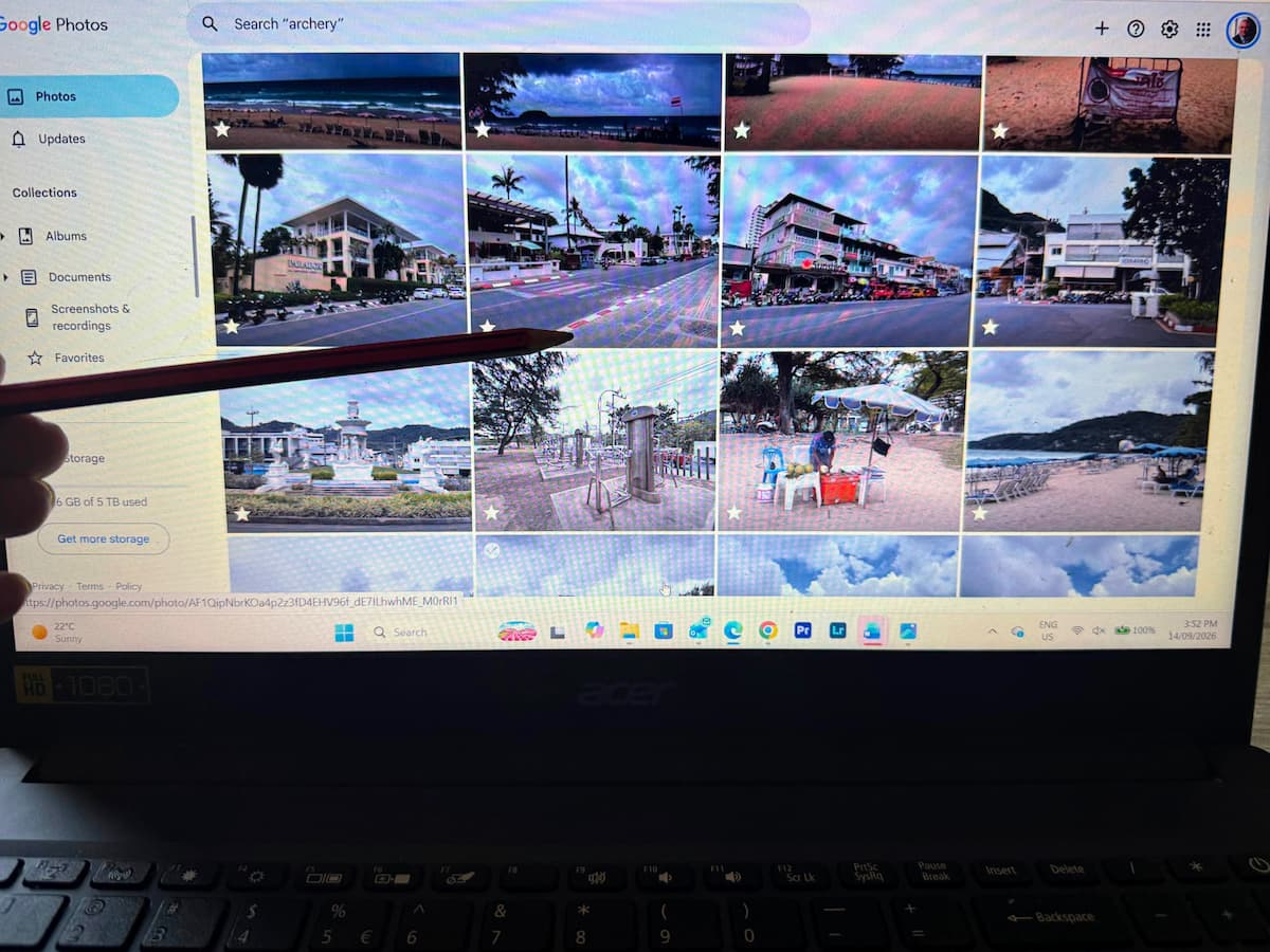
A travel guide to Patong could easily be filled with sunset photographs, palm trees and carefully framed sections of beach. Those images would communicate that Patong is a tropical holiday destination, but they would explain relatively little about what staying there is actually like.
The Travel With Insight Patong Travel Guide provides a useful example of why a broader mix of images matters.
Patong is not simply a beach. It is a developed resort town built around a wide bay, with roads, hotels, restaurants, shopping areas, nightlife, local neighbourhoods and hills rising behind the town.
A photograph showing the full sweep of the beach can therefore help a reader understand scale. A wider view from above can explain how the town sits around the bay. Street-level photographs can show development and walkability, while images from different parts of the beachfront can reveal that the character of Patong changes depending on where you are.
None of those photographs necessarily needs to be the strongest image from a photographic point of view.
Together, however, they answer questions that a collection of beautiful sunset photographs cannot.
That is an important distinction when selecting images for a travel guide: the individual photograph matters, but so does the information created by the collection as a whole.
What Other Travel Publishers Show Us
The same principle appears across established destination publishers: useful travel imagery often does more than create desire.
Tourism Australia, for example, regularly uses photographs to support practical information about destinations and experiences. Images can help communicate accessibility, the character of an environment, the type of activity involved and what travellers may encounter on arrival.
Visit California uses photography across its travel guides and planning content to show the character of different regions, landscapes and experiences. The images still inspire, but they also help readers understand what kind of place they are considering and what sort of trip it may suit.
These examples matter because they show that strong travel publishing does not rely on one type of photograph.
The most effective guides tend to mix aspirational images with contextual and explanatory ones. Some photographs make the destination appealing. Others help the reader understand whether it is suitable, practical or relevant to the trip they are planning.
That balance is what makes the imagery useful rather than merely decorative.
The Photograph That Looks Worse May Be More Useful
This is where image selection for travel guides can feel counterintuitive.
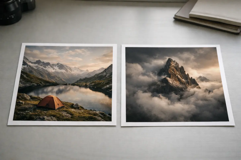
Imagine two photographs of the same beach.
The first was taken at sunset. The light is dramatic, the foreground is clean and the composition removes most of the surrounding development. It is clearly the stronger photograph from a visual point of view.
The second was taken during the day. The light is flatter, there are people on the beach, nearby buildings are visible and the road behind the sand can be seen.
For a portfolio, social post or destination advertisement, the first image may be the obvious choice.
For a travel guide explaining what that beach is actually like, the second image may be far more useful.
It gives the reader information.
They can judge the width of the beach, the level of development, how busy it feels, how close the road is and what the surrounding environment looks like. The photograph may be less beautiful, but it answers more practical questions.
That does not make the first image unnecessary. It may still be the perfect hero image or a strong choice for a section designed to create atmosphere.
The important point is that the two photographs are doing different jobs.
Once image selection is viewed that way, the question becomes much easier.
You are no longer asking which photograph is better.
You are asking which photograph is better for this specific part of the guide.
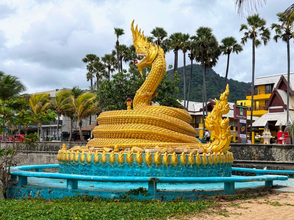
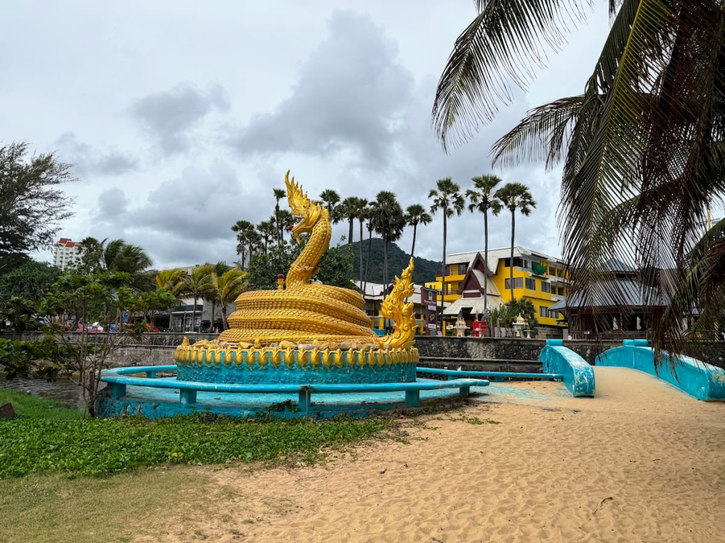
Two photographs of the same subject can serve different purposes. The tighter image identifies the monument, while the wider image provides more useful context about its surroundings and access.
A Simple Test Before Adding an Image
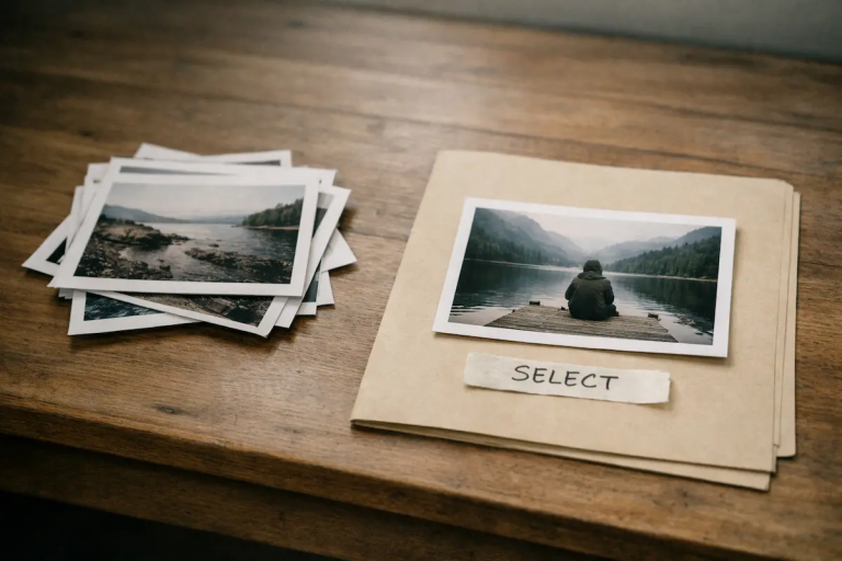
Before adding a photograph to a travel guide, it helps to ask a few simple questions.
- What does this photograph help the reader understand?
Does it show the place, explain access, reveal scale, communicate atmosphere or help the reader make a decision? - Is that information already being shown elsewhere?
Several attractive photographs that all communicate the same thing may add less value than one image showing something different. - Does the photograph represent the place honestly?
Strong editing, selective framing and unusual conditions can produce a beautiful image while giving the reader a distorted impression of what they are likely to experience. - What role is the image performing?
Is it there to inform, orient, compare, explain or inspire? Knowing the role makes it easier to judge whether the photograph is doing its job. - Would the guide lose anything if the image disappeared?
This is often the most revealing question.
If removing a photograph means the reader loses useful context, understanding or atmosphere, the image has earned its place.
If nothing meaningful changes, the photograph may simply be filling space.
That does not automatically mean it should be removed, but it does mean its purpose deserves a second look.
Not Every Image Needs to Be Informational
A travel guide would become very dry if every photograph were selected only for practical value.
Some images are there to create atmosphere, slow the reader down or remind them why the destination is worth visiting in the first place. A strong sunset, a plate of local food, a quiet street scene or a dramatic landscape can add emotion and visual rhythm even if it is not explaining anything specific.
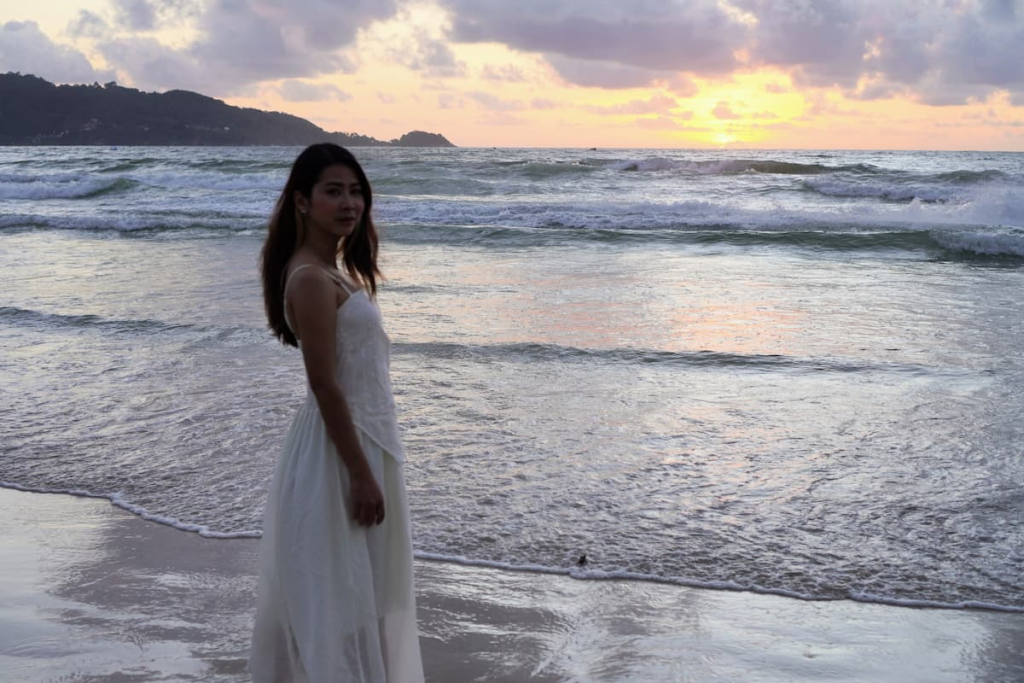
That matters.
The goal is not to remove decorative or inspirational photography. It is to use it deliberately.
Problems arise when decorative images begin occupying the places where the reader needs information. A beautifully framed close-up of a beach may work perfectly between sections, but it is a poor substitute for a wider image if the text is discussing access, development or how crowded the area feels.
The same photograph can therefore be useful in one position and unhelpful in another.
That is why image selection should be considered alongside the structure of the guide rather than as a separate visual task.
The best travel guides usually contain a mix: some images inform, some explain, some orient and some simply make the reader want to keep exploring.
Final Thought
When choosing photographs for a travel guide, it is easy to focus on which image looks strongest.
But that is only part of the decision.
A useful travel-guide image earns its place because it contributes something the reader would otherwise lose — context, orientation, comparison, explanation, expectation or atmosphere.
Sometimes that will be the dramatic photograph.
Sometimes it will be the ordinary-looking frame that shows the road, the buildings, the terrain or the people using the place.
And sometimes the ideal photograph simply will not exist.
You may not have taken it yourself. You may not be able to source a suitable image legally. The conditions may have been wrong, the angle may not have been available, or the photograph you need may simply not be in your library.
In those situations, the choice is often between using the best available image, accepting a less-than-perfect substitute, or deciding that the section does not need an image at all.
That is usually better than forcing in a photograph that looks attractive but adds little value.
The better question is not:
Which photograph looks best?
It is:
What does the reader need this photograph to do?
Once that becomes the starting point, selecting images becomes less about personal preference and more about helping the guide do its job.
Frequently Asked Questions: Travel Guide Photography
What makes a good photograph for a travel guide?
A good travel-guide photograph helps the reader understand something useful about the destination. That may include the appearance of a place, its scale, surroundings, access, atmosphere, terrain or how it compares with another location.
The strongest image is not always the most useful one. Context often matters more than visual impact.
Should every image in a travel guide be informational?
No. Travel guides also benefit from photographs that create atmosphere, emotion and visual interest.
The most effective guides usually combine informational images with more aspirational photographs. The important thing is knowing which role each image is performing.
How many images should a travel guide include?
There is no fixed number.
The right amount depends on the length of the guide, the complexity of the destination and how much visual information genuinely helps the reader. An image should earn its place rather than being added simply to break up text.
Is it better to use original travel photography or stock images?
Original photography can provide more specific and credible context, particularly when it shows the actual destination being discussed.
Stock images can still be useful when they accurately represent the subject and are legally available for the intended use. The key question is whether the photograph communicates the right information, not where it came from.
What if I do not have the ideal photograph?
Use the best suitable image you have, source an appropriate image legally if possible, or leave the section without an image.
A weaker but relevant photograph may be more useful than a beautiful image that communicates the wrong thing. In some cases, no image is better than one that misleads or adds nothing.
Should travel-guide images show crowds, buildings or other imperfections?
Sometimes, yes.
Those details may be exactly what the reader needs to understand. A travel guide should not deliberately make a destination look worse, but it should avoid removing so much context that the image creates an unrealistic expectation.
Continue Learning About Editorial Image Selection
Choosing photographs for travel guides is one example of a wider editorial decision: the strongest-looking image is not always the one that communicates most clearly.
The examples in this series look at real image-selection decisions — including photographs that were selected, photographs that were rejected, and situations where context or usefulness mattered more than visual impact.
Explore more Editorial Image Selection case studies →
Related Reading
Why the Best Photograph Isn’t Always the Right One
A practical example of choosing a photograph for the role it needs to perform rather than simply selecting the most visually impressive image.
Lead vs Supporting Images: How Visual Roles Shape a Page
A closer look at how different photographs can perform different jobs within the same article or page.
When an Image Earns Its Place: A Practical Guide to Image Selection Criteria
A framework for deciding whether an image genuinely contributes clarity, context or meaning to the content around it.
Not Sure Which Image to Choose?
Choosing between several good photographs can be surprisingly difficult. The most attractive image is not always the one that best supports the article, guide or message you are creating.
What Image Should I Choose? takes this decision further, with a practical approach to evaluating photographs based on purpose, relevance, context and what you need the viewer to understand.
If you regularly find yourself looking through a folder of photographs wondering which one actually belongs in your content, this guide is designed to make that decision easier.
Get the eBook: What Image Should I Choose? →
About Click Triangle
Click Triangle explores how photographs and visual content work in real publishing situations, with a focus on image selection, relevance, clarity and purpose.
Articles draw on practical image-selection decisions from websites, editorial content and digital publishing, using real examples to examine why an image was selected, rejected or used in a particular way.
The aim is practical rather than theoretical: to help creators, publishers and website owners make more deliberate visual decisions based on what an image needs to communicate.