Choosing the Right Images: A Practical Decision Framework
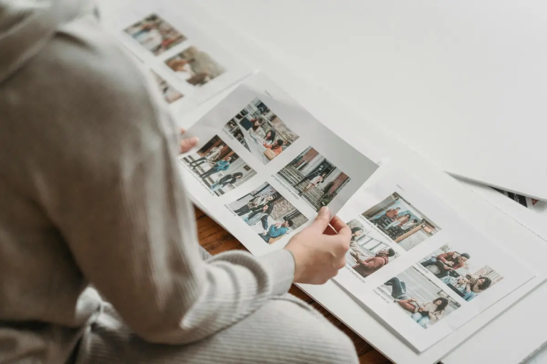
Choosing the right images looks simple from the outside. You review what you have, pick the strongest options, and move on. In practice, it rarely feels that clean.
Most image choices happen late, under mild pressure, and with more uncertainty than people admit. The images may be good. The intent may be reasonable. Yet the final selection still feels slightly off—safe, polite, or oddly interchangeable. Not wrong enough to challenge, but not strong enough to carry weight.
That gap between having good images and choosing the right ones is where most visual work quietly fails.
This article treats image choice as what it actually is: a judgement problem. Not a matter of taste. Not a technical hurdle. A decision made in context, shaped by habit, time pressure, and the fear of choosing badly.
Before frameworks or signals make sense, it’s worth understanding why this decision is harder than it appears.
Why image choice is harder than it looks
Images are deceptively complete. They arrive already finished, already framed, already confident. Unlike text, they don’t announce uncertainty. That makes selection feel like a matter of preference rather than judgement.
But image choice is rarely about whether an image is “good.” It’s about whether it does the job required of it—often a job that isn’t clearly defined when the decision is made.
When images are chosen for websites, publications, or editorial contexts, they are rarely viewed in isolation. They are asked to sit next to text, to open sections, to set tone, to establish credibility, or to carry emphasis without explanation. Those demands are subtle, and they change depending on where the image appears.
This is why image selection often feels uncomfortable even for experienced practitioners. The criteria are contextual, not intrinsic. You’re not judging the image alone—you’re judging its behaviour once it’s placed.
That distinction matters. It’s explored more directly in photography for websites how images actually work on a page, but the core problem shows up long before layout or publishing. It starts at the moment of choice.
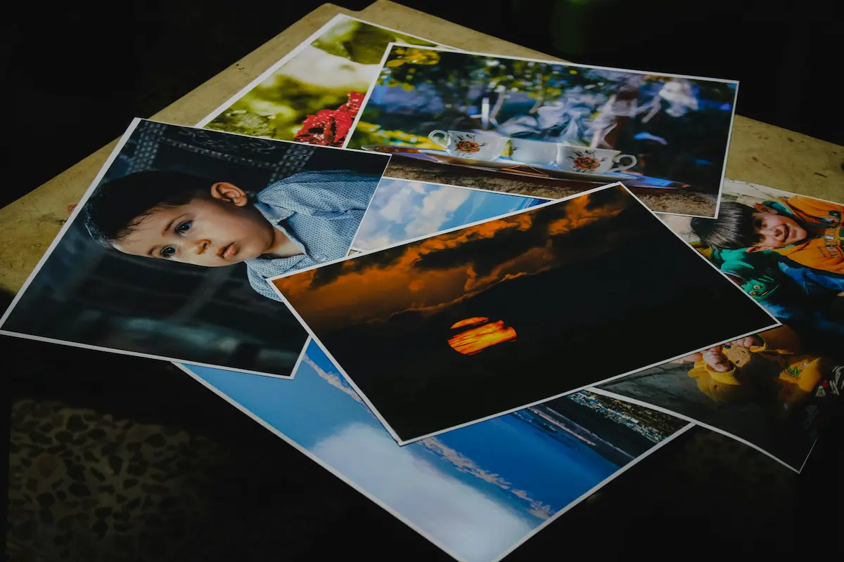
Abundance makes decisions worse, not better
The modern problem is not access to images. It’s excess.
Large libraries, long shoots, and endless variations create the illusion of flexibility while quietly eroding decisiveness. When everything is available, nothing feels clearly necessary.
Abundance changes the nature of the decision:
- Instead of asking which image earns its place, people ask which image feels least risky.
- Instead of removing weak options, they search for a version that offends no one.
- Instead of committing, they hedge.
The result is rarely a disastrous choice. It’s a diluted one.
This pattern isn’t unique to photography. Decision research consistently shows that too many options increase hesitation and reduce satisfaction. When stakes are unclear, people default to options that feel safe, familiar, or socially acceptable.
This effect is often described as the paradox of choice—the idea that increasing options can increase cognitive load, hesitation, and regret rather than confidence.
The same effect applies to image selection. Faced with dozens of competent images, people gravitate toward the ones that resemble what they’ve seen before. The image doesn’t need to say much—it just needs to avoid standing out in the wrong way.
That instinct is understandable. It’s also why so many visual outcomes feel interchangeable.
The quiet pull of “nice” images
When judgement is uncertain, “nice” becomes a proxy for “correct.”
Nice images are well-lit, balanced, pleasant, and easy to accept. They rarely provoke objections. They also rarely carry intent.
The problem with “nice” is not that it’s wrong. It’s that it’s non-committal. Nice images tend to smooth over distinctions rather than clarify them. They sit comfortably without doing much work.
People choose them because:
- They feel professional without requiring explanation
- They resemble what already exists in the space
- They reduce the risk of criticism
Over time, this creates a visual language built on avoidance rather than clarity. The images are fine, but they don’t decide anything.
This is where many people confuse taste with judgement. They assume that improving image choice means refining aesthetic preferences. In reality, the issue is often the absence of a clear decision about what the image is meant to accomplish.
Without that clarity, “nice” becomes the default.
Image choice under pressure
Most image decisions are made late in the process. The text is written. The page structure is set. A deadline is approaching. The image slot needs to be filled.
Under those conditions, the goal quietly shifts. Instead of asking what image strengthens this, the question becomes what image will work well enough.
Pressure changes behaviour in predictable ways:
- People rely on familiar patterns
- They avoid images that might need justification
- They choose faster over better
None of this reflects a lack of care. It reflects a realistic response to constraint.
This is why image choice is rarely a pure creative act. It’s a practical decision made alongside other competing demands. The more rushed the moment, the more conservative the choice.
Understanding this helps explain why good image libraries still produce weak selections. The failure isn’t in the material—it’s in the conditions under which judgement is applied.
Why removing images feels harder than adding them
One of the clearest signals that image choice is a judgement problem is how difficult removal feels.
Adding an image feels productive. Removing one feels risky.
Images accumulate meaning as they sit in a project. They represent time spent, effort invested, options preserved. Cutting them can feel like discarding value, even when the image isn’t doing much.
This leads to a common pattern:
- Multiple images are included “just in case”
- Weak images stay because they’re not actively harmful
- The overall visual message becomes diffuse
The reluctance to remove images isn’t about attachment to the photograph itself. It’s about uncertainty. If you’re not fully sure what the image is meant to do, you’re less confident removing it.
Strong image selection often involves subtraction. Not because fewer images are inherently better, but because each remaining image has to justify its presence.
That level of confidence doesn’t come from taste. It comes from judgement—knowing what the image is responsible for, and recognising when it isn’t meeting that responsibility.
Context is doing more work than you think
An image rarely fails on its own. It fails in relation to something else: the text it accompanies, the expectation it sets, or the role it was supposed to play.
This is why the same image can feel strong in one context and weak in another. The image hasn’t changed. The job has.
Understanding image roles—hero, support, separator, emphasis—helps clarify this, and it’s explored more explicitly in Image types explained choosing the right image for the job. But even without formal categories, most people sense when an image isn’t pulling its weight.
They just struggle to articulate why.
That struggle often leads to surface-level explanations: the image is “boring,” “flat,” or “not engaging.” These descriptions point to discomfort, not diagnosis.
The real issue is usually misalignment between what the image is doing and what the context requires.
The cost of unclear standards
When image choice relies on instinct alone, standards drift.
What felt acceptable last month becomes the baseline. What once stood out now blends in. Over time, the threshold for “good enough” quietly lowers—not because people want weaker outcomes, but because judgement hasn’t been made explicit.
Clear visual standards aren’t about rules. They’re about shared understanding. About knowing what counts in a given context.
This idea is unpacked further in visual standards what good photography means in practice, but the consequence shows up early: without articulated standards, image choice becomes reactive rather than deliberate.
People choose images that resemble previous choices. The work stabilises—but it also stagnates.
Why this is a judgement skill
Choosing the right image requires weighing competing factors that rarely resolve cleanly:
- Clarity versus subtlety
- Familiarity versus specificity
- Safety versus intent
There’s no formula that resolves these tensions. They’re navigated through experience, reflection, and the willingness to decide rather than defer.
This is why judgement improves slowly. It develops through noticing outcomes—what worked, what didn’t, and why a particular image failed to carry its weight.
Research into cognitive load and decision-making helps explain this. Work from organisations like Nielsen Norman Group consistently shows that clarity reduces effort, and ambiguity increases friction. Images that fail to clarify context don’t just underperform—they quietly tax the viewer.
Good judgement recognises this before it becomes visible as a problem.
Recognising when an image earns its place
At some point, the question has to sharpen.
Not is this a good image?
But is this image doing something that matters here?
Images that earn their place tend to do so quietly. They don’t announce themselves. They clarify. They stabilise meaning. They remove ambiguity rather than add to it.
This is where judgement becomes more precise. Not because the criteria are strict, but because the responsibility of the image is clearer.
An image earns its place when it carries weight that would otherwise fall on words, layout, or inference. It reduces the amount of work the viewer has to do to understand what they are looking at or why they should care.
When that happens, the image feels necessary rather than decorative.
This necessity is often felt before it is articulated. Editors and experienced practitioners recognise it as a sense of relief: the page settles once the right image is in place. Nothing else needs to compensate.
Why “fine” images often fail
Most weak image choices are not bad choices. They are non-decisions.
A fine image usually fails in one of three quiet ways:
- It repeats what the text already makes clear
- It introduces a tone that doesn’t quite belong
- It occupies space without changing the reader’s understanding
None of these are dramatic failures. That’s why they persist.
The image looks competent. It fills the slot. It avoids offence. But it doesn’t alter the reader’s relationship to the content. If removed, nothing meaningful would be lost.
This is the key test many people avoid: Would the page change if this image disappeared?
If the honest answer is no, the image has not earned its place — regardless of how attractive it is.
This is also where “nice” images quietly do the most damage. They create the illusion of completeness while leaving the underlying communication unchanged.
Signals that an image is wrong, even if it looks fine
Experienced judgement often shows up as discomfort rather than certainty.
There are recurring signals that an image is misaligned, even when no obvious flaw is present:
- The image needs explanation to justify its presence
- It feels interchangeable with several other options
- It pulls attention away from what actually matters
- It sets expectations the content doesn’t fulfil
These signals are subtle, and they’re easy to override when deadlines approach. But they are reliable.
One of the most telling signs is rationalisation. When you find yourself explaining why an image works rather than noticing how it works, judgement has likely been deferred.
Strong image choices rarely need defending. They feel proportionate to the context they inhabit.
The cost of repeated weak choices
Single image decisions rarely matter much on their own. Patterns do.
When weak-but-acceptable images are chosen repeatedly, they establish a visual norm. Over time, that norm becomes the standard against which new choices are judged.
This has long-term consequences:
- Visual language becomes vague
- Distinctions between sections blur
- Authority softens without anyone noticing
The work doesn’t collapse. It just loses edge.
This is why improving image choice is rarely about dramatic upgrades. It’s about stopping small compromises from accumulating.
Once standards drift, stronger images can start to feel out of place — too specific, too assertive, too demanding. That’s when judgement has already slipped.
Why frameworks help without becoming rules
Judgement doesn’t improve through rules, but it does benefit from structure.
Loose frameworks help because they give judgement something to push against. They surface questions that instinct alone may skip when time is short.
Useful frameworks don’t tell you what to choose. They clarify what the decision is actually about.
For image selection, that often means asking:
- What role is this image meant to play here?
- What ambiguity is it resolving?
- What expectation is it setting?
These are not instructions. They are orienting questions.
They slow the decision just enough to prevent defaulting to habit. They don’t remove uncertainty — they make it visible.
This kind of thinking aligns closely with how image roles function in practice, which is explored more directly in image types explained choosing the right images for the job. The goal isn’t categorisation for its own sake, but clearer responsibility.
Developing better judgement over time
Judgement improves through exposure to consequences.
Not dramatic ones — small, accumulative feedback:
- Noticing when an image fails to support the text
- Seeing where readers hesitate or disengage
- Recognising when a page feels heavier than it should
These observations rarely announce themselves as lessons. They’re noticed in hindsight, often vaguely at first.
The mistake many people make is assuming judgement improves through confidence. In reality, it improves through attention.
Attention to outcomes. Attention to friction. Attention to moments where the image didn’t quite do what was expected.
This is why experienced editors often appear decisive. They’re not guessing faster — they’re recognising patterns sooner.
Clarity as the underlying standard
Across contexts, roles, and formats, one standard holds.
The right image clarifies.
It clarifies intent.
It clarifies emphasis.
It clarifies what matters now.
This doesn’t mean every image must explain something explicitly. It means the image reduces uncertainty rather than contributing to it.
Research into visual cognition and usability consistently shows that unnecessary complexity increases cognitive load. When images fail to clarify, they quietly demand extra effort from the viewer — effort that could have been avoided.
This is why image choice is inseparable from judgement. You are deciding where to spend the viewer’s attention, and whether that expenditure pays off.
Choosing the right image, in practice
Choosing the right images is not about taste, courage, or originality.
It is about deciding.
Deciding what the image is responsible for.
Deciding whether it fulfils that responsibility.
Deciding to remove it when it doesn’t.
Most weak image choices happen not because people choose badly, but because they avoid choosing at all. They substitute safety for clarity and abundance for intent.
Better judgement doesn’t require stronger opinions. It requires clearer ones.
When images are chosen with that clarity, they stop competing for attention and start doing their work — quietly, precisely, and in proportion to the context they serve.
That is what it means to choose the right image.
Closing Thoughts
Choosing the right images is rarely about finding something better. It is about deciding what is necessary. That decision is shaped by context, pressure, and responsibility—not taste or visual confidence.
Strong image choices come from clarity about what an image is meant to do and the willingness to remove it when it does not. Over time, this leads to fewer images, firmer decisions, and work that feels more coherent without becoming rigid.
The difference is subtle but cumulative. Not between good and bad images, but between images that merely exist and images that earn their place.