Choosing Images Under Time Pressure
Most image mistakes don’t happen because teams don’t care.
They happen because the decision arrives late.
The layout is nearly finished, the deadline is close, and someone needs a photo that “works.” So the safest, nicest-looking option gets approved, not because it’s right, but because it ends the discussion. A week later the page looks polished — and slightly empty of meaning.
This article shows how to keep judgement intact when time is short.
Why Time Pressure Changes Image Decisions
Choosing images is rarely done in perfect conditions. In many real projects the decision happens late in the process, when deadlines are approaching and attention is already divided across multiple tasks. Designers may be finishing layouts, marketers may be reviewing copy, and editors may be preparing the page for publication. Under these conditions, choosing images under time pressure becomes less about careful evaluation and more about resolving the decision quickly enough to keep the project moving.
Time pressure changes how people judge images because the brain begins searching for shortcuts. Instead of asking whether a photograph actually improves the page, the decision often shifts toward what looks immediately appealing or what feels “good enough.” These shortcuts are understandable. When deadlines are tight, teams naturally try to reduce the amount of thinking required to reach a conclusion.
The problem is that image selection is not a neutral task. Photographs strongly influence how a page feels and how a message is interpreted. A rushed decision can quietly alter the tone of a page or introduce visual signals that were never intended. What looks like a minor choice can change how readers interpret the credibility, clarity, or focus of the content.
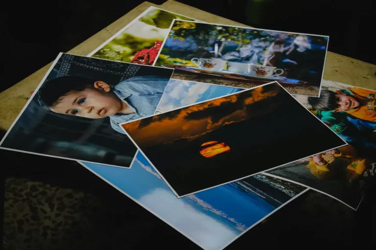
For this reason, choosing images under time pressure often produces a predictable pattern. Teams begin with a large library of options and quickly narrow the choices by removing anything that appears unusual or risky. Safe-looking images remain. These images are often technically polished and broadly attractive, but they are rarely specific to the purpose of the page.
This behaviour explains why many websites end up using photographs that feel interchangeable. They are not necessarily poor images, but they do not contribute meaningfully to the page either. They simply fill the visual space. The moment time pressure enters the process, the selection criteria quietly change.
Instead of asking whether an image strengthens the page, the question becomes whether the image is acceptable and unlikely to cause disagreement. The result is a gradual shift toward visual neutrality. Over time this pattern produces pages that look professional at first glance but fail to communicate anything distinctive.
Understanding this pattern is the first step toward improving image decisions. The goal is not to remove time pressure completely, because real projects rarely allow that luxury. The goal is to maintain clear judgement even when decisions must be made quickly.
A useful starting point is to remember that an image should justify its presence. If a photograph does not actively support the message of the page, it should not be included simply because a layout feels incomplete. This principle is explored in Choosing the Right Images: A Practical Decision Framework, which outlines how image roles can be evaluated before selection begins.
Another helpful perspective is recognising how often attractive photographs are chosen for the wrong reasons. When time is limited, visual appeal becomes an easy signal for quality. Yet attractive images frequently fail to support the message they accompany. This is discussed further in Why Nice Photos Are the Wrong Choice, where the difference between visual appeal and usefulness becomes clearer.
For teams responsible for publishing content regularly, recognising how choosing images under time pressure influences decisions can prevent a surprising number of small mistakes. The goal is not perfection. It is simply maintaining enough clarity in the decision process that images continue to support the message of the page rather than quietly weakening it.
The Most Common Shortcut: Choosing What Looks Good First
When deadlines tighten, image decisions rarely begin with analysis. They begin with visual appeal. Faced with a grid of possible photographs, teams naturally gravitate toward the images that appear the most polished, the most dramatic, or the most aesthetically pleasing. Under normal circumstances this might only be one consideration among many. Under pressure, however, it often becomes the primary filter.
This behaviour explains why choosing images under time pressure frequently produces results that look attractive but feel strangely disconnected from the content they accompany. The photograph may be technically strong, well lit, and visually engaging, yet it contributes very little to the message of the page.
The shortcut works like this: rather than asking what the page needs the image to do, the decision shifts toward which photograph feels most immediately impressive. The assumption is that a strong image will improve the page simply by being visually appealing. In practice, the opposite is often true.
A visually striking photograph can easily dominate attention, especially when placed near the top of a page. If the subject of that image does not clearly relate to the topic of the content, the viewer is forced to reconcile two different signals. The image suggests one thing while the text suggests another. Even when the mismatch is subtle, it creates friction in how the page is interpreted.
This is why attractive images are not always effective images. When choosing images under time pressure, the temptation to prioritise visual appeal can override more important questions about relevance, context, and clarity. The photograph that looks the best in isolation may not be the one that works best within the structure of the page.
This tendency also encourages the use of familiar visual patterns. Images that resemble commonly used stock photography often appear safe because they feel recognisable and professional. They carry a certain visual polish that makes them easy to approve quickly. Yet this same familiarity can make them interchangeable with countless other images across the web.
When that happens, the photograph stops contributing meaning. It becomes a generic signal rather than a specific one. The page may still appear visually complete, but the image no longer helps the viewer understand the subject more clearly.
Recognising this shortcut is important because it reveals how easily visual decisions drift away from the real purpose of imagery. The goal of an image is not to impress on its own but to support the message of the page. An image earns its place when it clarifies something that text alone cannot communicate as efficiently.
This distinction becomes clearer when considering the ideas explored in When an Image Earns Its Place (And When It Doesn’t). That article explains how usefulness, not attractiveness, should determine whether a photograph deserves inclusion.
When time pressure enters the process, the easiest images to approve are usually the most visually appealing ones. But strong image selection depends on resisting that instinct long enough to ask a more useful question: does this photograph actually help the page communicate more clearly?
Without that pause, the shortcut remains invisible, and image choices gradually drift toward aesthetics rather than purpose.
The Risk of Safe Choices
When time is limited, teams often try to avoid mistakes rather than make strong decisions. This shift in mindset has a subtle but important effect on image selection. Instead of looking for photographs that clearly support the message of a page, the goal becomes finding images that are unlikely to cause disagreement. In practice, this often leads to the same outcome: safe, generic visuals that appear professional but communicate very little.
This pattern is especially common when choosing images under time pressure. The safest option is usually the one that feels familiar. Images that resemble common stock photography styles are easy to approve quickly because they carry signals people already recognise. They look polished, balanced, and technically competent. Nothing about them appears risky or unusual.
Yet this sense of safety can be misleading. Images that feel universally acceptable are often the least specific to the subject of the page. They do not introduce errors, but they also do not contribute meaning. Instead of strengthening the message, they simply fill visual space.
Over time, repeated reliance on these safe choices produces pages that begin to look interchangeable. A technology company, a consulting firm, and a software product may all end up using similar imagery: confident professionals in bright offices, abstract close-ups of hands on laptops, or polished workspace scenes. Each photograph appears visually strong on its own, but collectively they reveal very little about the organisation behind the page.
This is why safety can quietly weaken communication. When the priority becomes avoiding criticism, the decision process gradually removes anything distinctive. The result is visual neutrality. The page may still look clean and professional, but it lacks the signals that help viewers understand what makes the subject unique.
Safe choices also reinforce another common mistake: selecting images that represent a general category rather than the specific topic of the content. For example, an article about digital products might be paired with a generic image of someone working at a computer simply because it feels relevant enough. The image does not contradict the subject, but it also does not clarify anything about it.
The challenge is that this behaviour feels reasonable when time is limited. When choosing images under time pressure, the safest decision is often the one that appears visually correct and easy to approve. However, image selection should not be evaluated only by how quickly agreement can be reached.
A more useful question is whether the image contributes something the page would otherwise lack. If the photograph merely repeats information already obvious from the text, its presence adds little value. If it introduces clarity, context, or specificity, then it begins to justify its inclusion.
This distinction becomes particularly important when considering stock imagery. As discussed in Stock Photography on Websites: When It Works, stock photographs are not inherently ineffective. They become problematic only when they are used as neutral placeholders rather than deliberate communication tools.
The risk of safe choices, therefore, is not that the images look bad. The risk is that they quietly dilute the message of the page. A photograph chosen simply because it feels safe may avoid immediate criticism, but it rarely strengthens the communication the page is meant to deliver.
When Teams Skip the Role Question
A second pattern often appears when deadlines approach. Teams stop asking what role an image should play and instead focus only on whether an image looks acceptable within the layout. This shift seems minor, but it changes the entire logic of image selection.
Every photograph on a page carries a certain amount of visual weight. Some images are naturally dominant because of their size, contrast, or subject matter. Others function more quietly, reinforcing the message of the page without drawing attention away from the surrounding content. When roles are defined clearly, these differences work together to create hierarchy.
When roles are ignored, hierarchy begins to collapse.
This problem appears frequently when choosing images under time pressure. Teams move quickly through image libraries, selecting photographs that appear suitable without considering how each one will function once placed on the page. A layout that initially contained one clear visual anchor may gradually accumulate several images with similar visual intensity.
The result is subtle but noticeable. Instead of guiding the viewer’s attention, the page presents multiple competing signals. Each image appears important, which means none of them clearly lead the visual experience. The viewer must decide where to look first, and that moment of uncertainty weakens the clarity of the page.
Understanding the distinction between image roles helps prevent this drift. Some images are meant to establish the visual tone of a page. Others provide supporting context, illustrating details or reinforcing ideas introduced in the text. When these roles are defined deliberately, the structure of the page becomes easier to read.
The relationship between these roles is explored more fully in Lead Images vs Supporting Images. That discussion shows how a page usually benefits from one image that carries the primary visual signal, while other images support the message without competing for attention.
When role assignment is skipped, the selection process becomes reactive. Teams respond to what appears visually attractive in the moment rather than evaluating how the images will interact once the page is assembled. A photograph that looks appealing in isolation may unintentionally overpower the content it accompanies.
This issue becomes even more pronounced when multiple contributors are involved. One person may choose a striking header image, another may add a visually intense photograph further down the page, and a third may introduce additional images to balance the layout. Each decision appears reasonable in isolation, but together they produce a page that lacks a clear visual centre.
The difficulty is that this problem often goes unnoticed during production. The images look individually strong, so nothing appears obviously wrong. Only when the page is viewed as a whole does the competition between images become visible.
Recognising this pattern is especially important when choosing images under time pressure. When decisions must be made quickly, defining the role of each image provides a simple structure that prevents visual hierarchy from dissolving into a collection of competing photographs.
A Simple Decision Framework for Fast Image Selection
When time is limited, the goal is not to analyse every possible image in detail. The goal is to preserve clear judgement while making decisions quickly. A simple framework can help maintain that clarity by focusing attention on the few questions that matter most.
This is particularly important when choosing images under time pressure, because the natural tendency is to react to what looks visually appealing rather than what actually supports the page. A short evaluation process helps prevent that shift.
One practical approach is to ask three questions before approving an image.
1. Does the image clarify the subject of the page?
The first responsibility of an image is to reinforce the meaning of the page it appears on. If the viewer saw the photograph before reading the text, would it point in the same direction as the content?
Images that introduce unrelated visual signals create confusion. Even when the mismatch is subtle, the viewer must reconcile two different interpretations: the one suggested by the image and the one presented by the text.
When choosing images under time pressure, this question becomes especially valuable because it quickly removes images that look attractive but fail to support the subject of the page.
2. Does the image add something the text cannot communicate as easily?
Images are powerful because they communicate certain kinds of information more efficiently than words. A photograph can show context, environment, or detail instantly. If an image simply repeats what the text already explains clearly, it may not be necessary.
This does not mean every image must introduce new information. Some images reinforce tone or atmosphere. But if the photograph contributes nothing beyond decoration, it rarely justifies the visual weight it adds to the page.
The principles behind this type of evaluation are discussed in Choosing the Right Images: A Practical Decision Framework, where the role of images is considered before the selection process begins.
3. Will the image compete with other visual elements?
Even a relevant image can cause problems if it dominates attention in the wrong place. Large or visually dramatic photographs may draw focus away from headings, calls to action, or key sections of content.
This is where an understanding of visual hierarchy becomes important. Research from the Nielsen Norman Group shows that users scan web pages quickly, focusing on elements that help them understand structure and meaning. Images that interrupt this scanning pattern can slow comprehension rather than improve it.
When choosing images under time pressure, considering hierarchy helps maintain balance within the layout. An image should support the structure of the page rather than compete with it.
A framework that supports speed
The advantage of this approach is that it reduces the decision to a small set of clear checks. Instead of debating which photograph looks best, teams can evaluate whether the image performs the role required by the page.
This framework does not eliminate time pressure, but it ensures that speed does not replace judgement. By asking a few focused questions, it becomes possible to move quickly through image options while still protecting the clarity and purpose of the final page.
Reducing Mistakes When Time Is Limited
Time pressure will always exist in real projects. Marketing campaigns have launch dates, articles have publication schedules, and product pages often need to be updated quickly. Because of this, the goal is not to eliminate time pressure but to reduce the number of mistakes it creates.
One of the most effective ways to do this is by establishing clear visual standards before the selection process begins. When teams already share an understanding of what qualifies as a strong image, the decision process becomes faster and more consistent. Instead of debating each photograph individually, the group can quickly recognise which options meet the established standard.
This approach becomes particularly valuable when choosing images under time pressure. Without shared standards, every decision must be negotiated in the moment. People rely on personal preference, and discussions about image quality or relevance can take longer than expected. When guidelines exist, many unsuitable options can be removed immediately.
These standards do not need to be overly complicated. In many cases they revolve around a few practical ideas: relevance to the subject, clarity of the visual message, and consistency with the tone of the site. The more familiar teams become with these expectations, the easier it becomes to make fast decisions without lowering the quality of the result.
The importance of this kind of consistency is explored further in Visual Standards: What Good Photography Means in Practice. That discussion explains how visual quality is not defined only by technical sharpness or dramatic lighting, but by whether the image communicates something clearly and supports the message of the page.
Another useful practice is maintaining a well-organised image library. When suitable images are easy to locate, teams spend less time searching through large collections of unrelated photographs. This reduces the temptation to approve the first acceptable image simply to move the project forward.
Preparation also plays a role. If designers and editors regularly work with a set of trusted image sources, they become familiar with the visual style and subject matter those libraries provide. That familiarity speeds up the process of identifying images that fit the purpose of the page.
Finally, it helps to remember that not every page requires multiple images. When choosing images under time pressure, the easiest way to avoid mistakes is sometimes to include fewer images rather than more. Each additional photograph introduces another decision and another opportunity for visual confusion.
A small number of well-chosen images usually communicates more clearly than a page filled with decorative visuals. When time is limited, focusing on the images that genuinely strengthen the message of the page is often the most reliable strategy for maintaining quality.
Conclusion
Time pressure is a normal part of publishing work. Pages need to be completed, campaigns must launch on schedule, and content teams rarely have the luxury of evaluating every image option in detail. Because of this, the challenge is not removing deadlines from the process but maintaining clear judgement while working within them.
Throughout this article we have examined how choosing images under time pressure changes the way visual decisions are made. When time is limited, teams often rely on shortcuts. They gravitate toward images that look impressive, feel safe, or are easy to approve quickly. While these shortcuts help decisions happen faster, they frequently weaken the clarity and purpose of the final page.
The most effective way to avoid these mistakes is to keep the role of an image in focus. A photograph should not be included simply because it fills visual space or makes a layout feel complete. It should contribute something meaningful to the communication of the page, whether that means clarifying the subject, reinforcing context, or guiding the viewer’s attention.
When the decision process remains grounded in purpose, speed becomes less dangerous. Even under tight deadlines, teams can move quickly through image options while still protecting the message the page is meant to deliver.
In the end, choosing images under time pressure is not about finding perfect photographs. It is about ensuring that the images selected continue to support the structure and meaning of the page rather than quietly distracting from it.
FAQs
1. Why is choosing images harder when time is limited?
When time is short, teams often rely on visual shortcuts. Instead of evaluating how well an image supports the message of a page, they may choose the most attractive or safest-looking option simply to complete the task quickly.
2. What is the biggest mistake when choosing images under time pressure?
The most common mistake is selecting images based on visual appeal alone. Attractive photographs can look impressive but may not support the subject or purpose of the page, which weakens the overall communication.
3. How can teams choose images quickly without lowering quality?
A simple decision framework helps. By asking whether the image clarifies the subject, adds meaningful context, and fits the visual hierarchy of the page, teams can make faster decisions without relying on guesswork.
4. Are stock photos more likely to be used when time is limited?
Yes. Stock images are often easy to access and approve quickly, which makes them appealing when deadlines are tight. However, they should still be evaluated carefully to ensure they genuinely support the content.
5. Should every page include an image?
Not necessarily. Images should be included only when they strengthen the message of the page. If a photograph does not clarify the subject or add useful context, it may simply act as decoration.
6. How does time pressure affect visual hierarchy?
When images are chosen quickly, teams may overlook how each image interacts with the layout. This can result in multiple images competing for attention instead of supporting a clear visual structure.
7. What helps prevent poor image decisions during tight deadlines?
Clear visual standards and organised image libraries make a significant difference. When teams already know what qualifies as a suitable image, they can make faster decisions without sacrificing quality.