Choosing Between Two Good Photos: What Actually Matters
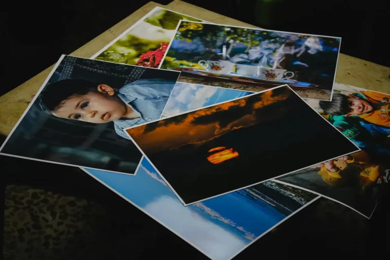
Most image decisions are easy. Weak photos eliminate themselves quickly. The real difficulty begins when two images both look strong. At that moment the usual rules stop helping, and the choice quietly shifts from photography to judgement.
Introduction — The Moment of Real Difficulty
Most image selection decisions are relatively easy. Weak photographs tend to eliminate themselves quickly. A blurry image, a confusing composition, or a photo that clearly does not match the subject of the page is usually rejected without much discussion. In the early stage of image review, the obvious problems disappear quickly and the remaining options start to look strong.
The real challenge appears later.
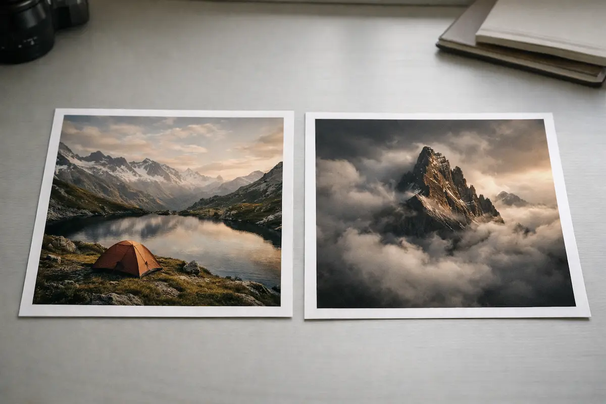
The moment that slows people down is when they find themselves choosing between two photos that both appear good. At that point the usual shortcuts stop working. Neither image is obviously wrong. Both may be well composed, technically sound, and visually appealing. Each photograph looks capable of doing the job.
This is where image selection often becomes unexpectedly difficult.
When teams are choosing between two photos, the discussion frequently drifts toward personal reactions. One person may prefer the lighting in one image, while another may like the composition or colour in the other. Because both photographs look strong, the conversation can quickly become subjective. The decision becomes about which photo people like more rather than which photo actually works better for the page.
But the most useful question is rarely which photograph is more attractive.
On a website, photographs are not chosen for their own sake. They are part of a larger structure that includes the page layout, the written content, and the purpose of the page itself. An image may look impressive in isolation yet still fail to support the message or intention of the page where it appears.
Understanding this difference changes how choosing between two photos should be approached. Instead of comparing the photographs purely on visual appeal, the decision becomes about the role the image needs to perform. Once that shift happens, the comparison between two strong photos becomes far easier to resolve.
Why This Situation Creates So Much Indecision
Once the obvious weak images have been removed, the remaining photographs often appear equally strong. At that stage the selection process enters a more difficult phase. The team is no longer rejecting poor options; it is choosing between two photos that both seem capable of working.
This situation creates a particular kind of hesitation.
When people are choosing between two photos, the usual decision shortcuts disappear. Technical problems are no longer present. The images may both be well exposed, well composed, and visually appealing. Without a clear reason to reject either option, the discussion often loses direction.
In many teams, the conversation quickly shifts toward personal reactions. Someone may feel that one photograph looks more polished. Another person may prefer the lighting in the alternative image. A third may simply respond more strongly to one scene than the other. None of these reactions are necessarily wrong, but they rarely provide a reliable way to resolve the decision.
As a result, the discussion can stretch far longer than expected.
People compare the images again, sometimes reopening the files or viewing them at different sizes. Additional opinions may be requested from colleagues who were not originally involved in the decision. What began as a small visual choice can slowly turn into a prolonged debate.
This hesitation is not really about the photographs themselves. It usually appears because the team lacks a clear framework for evaluating images once the obvious problems have been removed. When people do not have practical criteria to guide the decision, they naturally fall back on preference.
That pattern is closely related to the problem discussed in The Hidden Cost of Indecision in Image Selection, where small visual decisions can quietly slow down entire projects. When teams hesitate repeatedly during image review, production momentum weakens and the clarity of the page can suffer.
The difficulty of choosing between two photos therefore does not come from a lack of visual taste. It comes from the absence of a structured way to evaluate images when both appear good. Once the decision shifts from personal preference to the role the image plays on the page, the comparison usually becomes far easier to resolve.
Good Photos Are Not Automatically the Right Photos
A major reason choosing between two photos becomes difficult is that both images may genuinely be good photographs. They might be well composed, technically correct, and visually appealing. In isolation, either image could feel like a strong choice.
But a good photograph is not automatically the right photograph for a page.
When people are choosing between two photos, the evaluation often focuses on visual quality. Teams compare lighting, composition, colour, and overall polish. These characteristics are important in photography, but they do not necessarily determine whether the image works well in the context where it will appear.
Web pages do not exist to showcase photography. Their primary purpose is to communicate something to the reader. Images support that goal by clarifying ideas, showing context, or helping the viewer understand the subject more quickly. If a photograph does not contribute to that task, its visual quality alone does not make it the right choice.
This difference between visual quality and usefulness is where many image decisions go wrong.
A photograph may look impressive because it uses dramatic lighting or strong colour contrast. It might have a pleasing composition that immediately attracts attention. Yet when placed on a webpage, the same image might reveal very little about the subject. The viewer may still need to read carefully or search the page to understand what they are looking at.
Another photograph may appear simpler or less visually dramatic, yet it may explain the subject far more clearly. It might show the environment, the activity, or the context that allows the reader to understand the situation within a second or two.
In that case, the simpler image is usually the stronger choice.
This idea connects closely with the argument explored in Why Nice Photos Are the Wrong Choice, where aesthetically pleasing images can sometimes distract from clearer communication. It is also related to the principle discussed in When an Image Earns Its Place (And When It Doesn’t), where a photograph must justify its presence by contributing something meaningful to the page.
Once this distinction becomes clear, choosing between two photos starts to look very different. The goal is no longer to decide which photograph is more impressive. Instead, the decision becomes about which image actually earns its place by helping the page communicate more effectively.
The Page’s Job Decides the Image
When people are choosing between two photos, the most reliable way to resolve the decision is to step back from the photographs themselves and look at the page where the image will appear. Images on websites are not independent objects. They exist within a structure that includes text, layout, navigation, and a specific purpose.
Every page has a job.
A landing page may need to establish trust quickly and help visitors understand what is being offered. A product page must show the product clearly so that uncertainty is reduced. A blog article may use images to clarify a concept or provide visual context for the topic being discussed. Each of these situations places different demands on the photograph that appears on the page.
When teams forget this, image selection becomes disconnected from the page’s purpose. During choosing between two photos, the discussion often focuses on which photograph looks stronger visually. Lighting, colour, and composition start to dominate the comparison. But visual strength alone does not determine whether the image supports the page effectively.
Consider a page introducing a service. One photograph might show a dramatic portrait with strong lighting and a clean composition. The other might show the same person working within their environment, surrounded by the tools or context that explain what they actually do. The first image may look more striking as a photograph, yet the second may help visitors understand the service far more quickly.
In that situation, the clearer image usually supports the page better.
The same principle applies across many types of content. When choosing between two photos for a product page, the image that shows scale or real-world use often provides more value than the image that simply looks attractive. In an article, the photograph that reveals context or demonstrates the subject may help the reader far more than a visually dramatic but ambiguous image.
Once the role of the page becomes the primary reference point, many image comparisons become easier to resolve. The decision stops being about which photograph is more impressive and becomes about which image helps the page perform its task more effectively.
Framing the decision this way often removes much of the uncertainty that appears when choosing between two photos. The image that aligns most closely with the page’s purpose usually becomes the clearer choice.
The Image That Clarifies Usually Wins
When people are choosing between two photos, the most reliable deciding factor is often clarity. The image that helps the viewer understand the subject more quickly usually performs better on the page.
This matters because visitors rarely study website images carefully. Most people scan a page quickly, forming an understanding of the content within a few seconds. During that brief moment, images play a powerful role in helping the viewer interpret what the page is about. If a photograph communicates the subject immediately, it supports that rapid understanding.
If it does not, the viewer must spend extra effort interpreting what they are seeing.
When choosing between two photos, it is common for one image to appear more visually dramatic while the other provides clearer information. The dramatic image might use strong lighting, a tighter crop, or a shallow depth of field that isolates the subject. These qualities can make the photograph look visually striking, but they sometimes remove important context.
The alternative image may be less dramatic but reveal more about the situation. It might show the surrounding environment, additional objects, or the activity taking place. These elements help the viewer interpret the scene without needing to think about it.
In many cases, the clearer image serves the page better.
This principle also relates to how people judge the credibility of websites. Research from the Stanford Web Credibility Project found that users form impressions about a website very quickly based on visual cues and overall clarity. Images that clearly show what is happening help reinforce those early impressions, while images that feel decorative or ambiguous can create uncertainty.
During choosing between two photos, clarity therefore becomes an extremely useful decision tool. The image that explains the subject more quickly tends to reduce confusion and support the reader’s understanding of the page.
This does not mean the most literal photograph will always be correct. Visual tone and atmosphere can still matter. But when two strong images compete and the decision becomes difficult, the photograph that clarifies the subject more quickly usually provides the stronger contribution to the page.
Emotional Appeal Is Often the Trap
When people are choosing between two photos, emotional reaction can easily influence the decision. One image might have warmer light, richer colour, or a more dramatic composition. It may feel more powerful or visually impressive at first glance, and that immediate response can quickly shape the discussion.
But emotional appeal is not always the same as usefulness.
A photograph that produces a strong emotional response often looks like the obvious choice during a review. People respond naturally to mood, atmosphere, and visual drama. These qualities can make an image feel memorable and engaging. Because of this, the more dramatic photograph often wins internal debates.
The difficulty appears when emotional impact replaces practical evaluation.
During choosing between two photos, the image that feels more exciting may not always communicate the subject clearly. Strong lighting might hide important details. A very tight composition may remove the surrounding context that helps the viewer understand what is happening. A visually dramatic image may look impressive but reveal very little about the actual situation.
In those cases, the photograph becomes visually appealing but informationally weak.
This pattern appears frequently when teams review images together. Someone reacts positively to the photograph that “looks better,” and the discussion gradually moves toward aesthetic preference rather than communication. The image that creates the strongest emotional reaction often dominates the conversation even if another photograph explains the subject more clearly.
Over time, this tendency can lead to the problem discussed in Why “Safe” Images Quietly Weaken Brands. When teams rely heavily on emotional appeal, they often select images that feel pleasant but vague. The photographs decorate the page rather than helping the reader understand the content.
Emotion itself is not the problem. Visual tone can be an important part of communication. The difficulty arises when emotional reaction becomes the primary reason for selecting an image. When that happens, the page may lose clarity even though the photograph appears attractive.
Recognising this tendency can help teams pause during choosing between two photos and ask a more practical question: which image actually helps the viewer understand the page better?
A Simple Test for Breaking the Tie
Even after applying the ideas above, teams sometimes still find themselves choosing between two photos that appear equally strong. Both images may be technically sound, visually appealing, and relevant to the page. At that point, continuing to debate small visual differences rarely helps.
What usually helps is introducing a simple decision test.
The goal of the test is not to analyse the images endlessly. It is to identify which photograph supports the page slightly more effectively. When people are choosing between two photos, a few focused questions can quickly reveal which image provides greater clarity or usefulness.
One practical approach is to ask three straightforward questions.
First, which image explains the subject faster?
Look at each photograph briefly and imagine a new visitor seeing it for the first time. The image that allows the viewer to understand what is happening almost immediately usually provides stronger support for the page.
Second, which image reduces uncertainty?
Sometimes both photographs appear attractive, but one leaves small questions unanswered. The environment might be unclear, the subject may be partially hidden, or the activity may be difficult to interpret. The photograph that removes those uncertainties often works better in a web context.
Third, which image supports the page’s objective?
Return to the purpose of the page itself. If the page introduces a service, the photograph should help explain that service. If the page supports an article, the image should clarify the topic being discussed. When choosing between two photos, the image that aligns more closely with the page’s role usually contributes more value.
If one photograph clearly performs better in two of these three comparisons, the decision is often clear enough to move forward.
This approach is particularly useful when teams must make decisions quickly. In Choosing Images Under Time Pressure, the ability to evaluate photographs efficiently becomes essential for maintaining production momentum. A simple framework like this prevents the conversation from drifting back toward personal preference.
Most importantly, the test keeps the decision anchored to the needs of the page rather than the attractiveness of the photograph itself. Even when choosing between two photos that both appear strong, one image will usually support the page slightly better once these questions are applied.
The 10-Second Tie-Breaker
If you’re still choosing between two photos, run this quick test: blur your eyes slightly (or step back from the screen) and look at each image for one second. Then ask: what is this page about? If one image makes the answer clearer immediately, choose that one. If both answers are vague, the images are functioning as decoration, not communication. This is especially important when decisions need to happen fast and you can’t afford long debate — the process in Choosing Images Under Time Pressure explains how to keep momentum without lowering standards.
The Decision Is About the Page, Not the Photo
When people are choosing between two photos, the natural instinct is to compare the photographs themselves. Teams examine composition, lighting, colour, and overall visual impact, hoping that one image will eventually appear superior to the other.
But this comparison rarely resolves the real question.
The decision is not about which photograph is better in isolation. It is about which image helps the page perform its role more effectively. Once this shift in perspective happens, choosing between two photos becomes far less subjective.
Instead of debating visual preference, the focus returns to the function of the page. One photograph may clarify the subject more quickly. Another might reveal the surrounding environment more clearly. A third may align more naturally with the message the page is trying to communicate.
When evaluated in this way, the difference between the images often becomes easier to see.
Both photographs may remain good images, but only one will usually support the page’s objective slightly better. The stronger choice is the photograph that helps the reader understand the subject faster and with less effort.
This perspective also removes some of the pressure that often surrounds the decision. Rejecting one image does not mean it is a poor photograph. It simply means that, in this specific context, another image performs the role more effectively.
Over time, adopting this mindset improves the consistency of image selection. Decisions become quicker, discussions become clearer, and photographs begin to serve the page more deliberately.
In the end, the most reliable way to resolve the difficulty of choosing between two photos is to remember that the photograph is only one part of the page. The page itself remains the priority, and the image that supports it best is usually the right choice.
FAQ
How do you decide between two photos that both look good?
Focus on which image helps the page communicate more clearly. The best choice is usually the photo that explains the subject faster and reduces uncertainty for the viewer.
Why is choosing between two photos so difficult?
The difficulty appears when both images seem technically strong. Without clear criteria, teams often rely on personal preference instead of evaluating which photo actually supports the page.
Should the most visually impressive photo always be chosen?
Not necessarily. A visually dramatic photo may attract attention but still fail to explain the subject clearly. Clarity and usefulness often matter more than visual impact.
What makes one photo more useful than another?
A useful photo quickly communicates context, activity, or subject matter. It helps the viewer understand the page without needing to interpret what they are seeing.
Does emotional impact matter when selecting photos?
Emotion can support communication, but it should not dominate the decision. Images chosen purely for atmosphere may weaken clarity on the page.
How quickly do people judge images on websites?
Research shows users form impressions very quickly when visiting a website. Images that clearly show the subject help reinforce trust and understanding.
What is the best test when two photos appear equal?
Ask which image explains the subject faster, reduces confusion, and supports the page’s objective. The image that performs better in these areas usually serves the page best.