How Marketing Teams Choose the Wrong Photos
Most marketing teams don’t pick “bad” photos.
They pick photos that look safe, polished, and brand-consistent — and then wonder why pages feel slightly weaker than they should. The problem usually isn’t quality. It’s that the image is doing the wrong job.
Most marketing teams do not choose bad photos.
They choose reasonable photos under unclear conditions. The image looks polished. It fits the brand colour palette. It feels professional. No one in the room objects strongly. The page goes live.
Weeks later, performance feels slightly weaker than expected.
This is how marketing teams choose the wrong photos — not through incompetence, but through subtle misalignment. The issue is rarely technical quality. It is almost always role confusion.
An image can be well composed, well lit, and commercially acceptable while still weakening the page it appears on. It may introduce ambiguity instead of clarity. It may compete with the headline instead of supporting it. It may signal tone that contradicts the offer.
When teams evaluate images primarily through taste, brand mood, or aesthetic consistency, structural questions often go unasked. What is this page trying to accomplish? What responsibility should the image carry? Is the image reducing uncertainty or increasing it?
Understanding how marketing teams choose the wrong photos requires examining process rather than preference. The patterns are predictable. They emerge from vague briefs, compressed timelines, unspoken standards, and decision-making driven by opinion instead of role.
The result is rarely dramatic failure. It is quiet friction.
And quiet friction compounds.
Before addressing taste or creativity, it is worth examining the structural conditions that make misalignment likely.
The Brief Is Often Vague
The first weakness usually appears long before any image is selected.
It begins with the brief.
Marketing briefs frequently describe tone rather than function. Teams request imagery that feels “modern,” “professional,” “premium,” or “friendly.” These descriptors may help narrow style, but they do not define responsibility.
Without clarity around page intent, image selection becomes aesthetic negotiation.
A landing page and a blog post might both be described as needing something “clean and modern.” Yet their objectives differ. One must reduce uncertainty and guide action. The other must support explanation and sustain attention. If the brief does not specify which environment the image will operate within, evaluation becomes subjective.
This is one of the foundational reasons how marketing teams choose the wrong photos follows predictable patterns. The criteria are incomplete from the beginning.
When the image’s job is undefined, teams default to surface-level agreement. They choose what looks polished. They choose what matches brand guidelines. They choose what feels safe.
But safe is not the same as aligned.
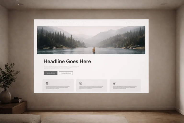
As explained in Photography for Websites: How Images Actually Work on a Page, images either support the structural goal of a page or they function as decoration. When the brief fails to define the structural goal, decoration often wins by default.
Clarity in the brief does not mean prescribing exact imagery. It means articulating responsibility. Is the image meant to reassure? To clarify scale? To introduce context? To reinforce authority? To break visual monotony?
Without those distinctions, selection meetings drift toward preference-based decisions.
And preference-based decisions rarely produce consistent standards.
Before debating which image looks stronger, teams benefit from answering a simpler question:
What must this image accomplish for this specific page?
Until that question is explicit, misalignment is not accidental — it is inevitable.
Brand Consistency Is Mistaken for Page Clarity
Consistency is often treated as the highest visual virtue.
Marketing teams invest heavily in defining a brand look: colour palettes, type systems, photography style, lighting mood, editing tone. Once established, that visual language is applied across landing pages, blog posts, product pages, and campaign assets.
The intention is sensible. Consistency signals professionalism.
The problem emerges when consistency overrides context.
A visual style that works well in one environment may weaken another. A restrained, editorial photography style might support educational content beautifully but feel too distant on a conversion-focused page. A bold, emotionally persuasive hero image might energise a landing page while overpowering a thoughtful blog article.
This confusion explains part of how marketing teams choose the wrong photos. The decision filter becomes: “Does this match our brand?” rather than, “Does this match the job of this page?”
Brand coherence should operate at the level of quality and standards — not identical behaviour.
For example, a company might favour bright, high-key imagery featuring people in collaborative settings. That style may work effectively on recruitment or culture pages. But applied uncritically to technical documentation or analytical articles, it can introduce tonal dissonance. The image signals emotion while the content demands clarity.
The issue is not that the photography is weak. It is that the role is misapplied.
Research from the Stanford Web Credibility project found that users frequently judge a site’s credibility based on design cues before fully engaging with the content. Professional appearance increases trust — but only when it reinforces clarity. When visuals feel generic or disconnected from purpose, credibility weakens despite polished presentation.
As explored in Choosing Images for Landing Pages vs Blog Posts, page intent changes image responsibility. Treating every page as if it carries the same persuasive weight ignores the psychological differences between environments. Visitors reading an article tolerate nuance. Visitors evaluating a service page prioritise reassurance.
When brand consistency is mistaken for page clarity, image decisions become automatic. The same type of hero layout appears everywhere. The same stock category is reused. Over time, pages begin to feel visually interchangeable, even if their objectives differ.
Strong brands do not look identical across every surface. They apply consistent standards while allowing context to shape behaviour.
The distinction is subtle, but it is critical.
Without it, coherence turns into rigidity — and rigidity quietly erodes performance.
The Loudest Voice Wins
Not all image decisions are structural failures. Some are political.
In many marketing environments, image selection becomes a meeting exercise rather than a standards exercise. Several options are presented. Opinions are shared. Preferences are expressed. The image that receives the least resistance — or the strongest endorsement from a senior voice — is chosen.
This is another way how marketing teams choose the wrong photos without realising it.
When authority or enthusiasm replaces criteria, evaluation becomes subjective. A senior stakeholder might favour a dramatic, emotionally charged photograph because it feels bold. A creative lead might prefer a minimalist image because it aligns with their design instincts. A product manager might choose the clearest literal depiction because it feels safe.
Each preference may be reasonable in isolation.
The problem is that none of them answer the structural question: what must this image accomplish for this specific page?
Without agreed standards, meetings default to taste arbitration. The most persuasive voice in the room — not the most relevant argument — determines the outcome. This introduces variability. On one page, a subtle image wins. On another, a high-impact visual dominates. The differences are not strategic; they are circumstantial.
Over time, this pattern creates inconsistency that feels difficult to diagnose. No single decision appears flawed. Each choice seemed defendable at the moment it was made. Yet the cumulative effect is drift.
Strong visual systems reduce the influence of personal preference. They establish criteria before options are reviewed. They define image roles before evaluating style. When those guardrails exist, discussion becomes more productive. Instead of asking which image feels stronger, teams ask which image better supports the page’s objective.
When that shift does not happen, selection meetings reward conviction rather than alignment.
And conviction, while useful in leadership, is a weak substitute for standards.
Speed Creates Compromise
Even with clear briefs and thoughtful teams, time pressure changes decisions.
Campaign deadlines compress review cycles. Product updates require fast turnaround. Landing pages are launched quickly to test messaging. Under these conditions, image selection often becomes reactive rather than deliberate.
This is another predictable reason how marketing teams choose the wrong photos.
When speed dominates, evaluation criteria narrow. Instead of asking whether the image fulfils a structural role, teams ask whether it is “good enough to ship.” The difference seems small in the moment. The impact accumulates over time.
Fast decisions encourage convenience:
- Using an image already licensed instead of sourcing a more appropriate one
- Selecting the safest stock option because it feels low risk
- Reusing a previous hero because it fits the layout
- Avoiding internal debate to preserve momentum
None of these decisions are irrational. They are responses to pressure.
The issue is that urgency shifts the standard. Clarity gives way to adequacy. Alignment becomes secondary to speed. Once this pattern repeats across multiple pages, visual consistency begins to drift.
As discussed in Choosing Images Under Time Pressure, compressed timelines reduce tolerance for nuanced evaluation. The more rushed the environment, the more likely teams are to default to what looks polished rather than what functions precisely.
This does not mean speed is incompatible with quality. It means that speed requires predefined criteria. Without them, compromise becomes habitual.
In practice, this often results in pages that appear visually competent but structurally imprecise. The image supports the layout, but not the intent. It fills space without clarifying purpose.
When teams later analyse underperformance, they rarely attribute it to the image decision made in a hurried review. Yet the initial compromise may have introduced friction at the first point of contact.
Speed is unavoidable in marketing. Drift is not.
The difference lies in whether selection standards are strong enough to survive compression.
Editing Is Used to Fix Selection Errors
When an image feels slightly wrong, the instinct is rarely to replace it.
The instinct is to adjust it.
Brightness is increased. Contrast is softened. The crop is tightened. A colour overlay is applied to align with brand tones. These refinements can improve cohesion, but they do not change the image’s structural role.
This pattern reveals another way how marketing teams choose the wrong photos without recognising it.
Editing becomes a compensatory tool.
If an image lacks clarity for a landing page, no filter will make it clarify the offer. If a photograph introduces emotional intensity into an analytical blog post, reducing saturation will not realign its tone. Surface refinement does not resolve structural mismatch.
The distinction matters.
As explored in Editing the Selection, Not the Photo, image performance is determined at the point of selection. Editing is refinement, not rescue. When teams attempt to “fix” an image through aesthetic adjustment, they often reinforce the original misalignment.
This habit forms because editing feels productive. It gives the impression of progress. It avoids reopening the sourcing process. It preserves momentum.
But the deeper question remains unanswered:
Is this image responsible for the correct job?
If the answer is unclear, further adjustment usually compounds the issue. The image may become visually cohesive while remaining strategically imprecise.
Over time, this creates a subtle pattern across a website. Images appear technically consistent but function inconsistently. Some clarify. Others decorate. A few unintentionally compete with the content they accompany.
Strong visual systems separate two decisions:
Selection determines role.
Editing refines execution.
When those stages blur together, correction replaces criteria — and criteria are what prevent misalignment in the first place.
Stock Photography Without Standards
Stock photography is not inherently weak.
In many contexts, it is efficient, cost-effective, and entirely appropriate. The problem is not stock itself. The problem is using stock without criteria.
This is another pattern in how marketing teams choose the wrong photos.
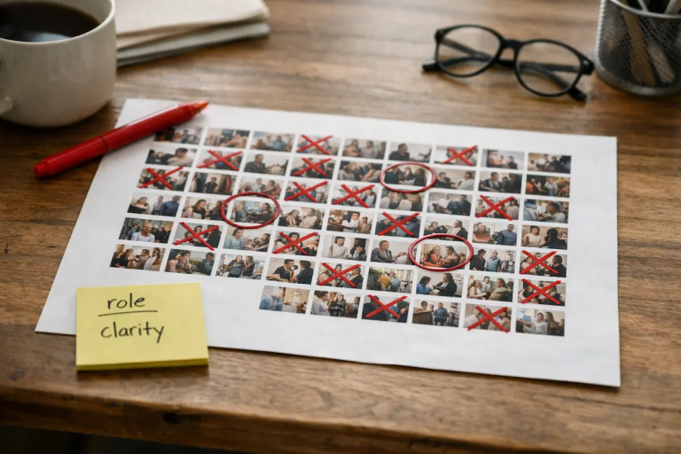
When sourcing from large libraries, teams are confronted with volume. Thousands of visually appealing options appear instantly. Under pressure, selection often defaults to what feels safest: smiling professionals, collaborative workspaces, abstract productivity imagery, aspirational lifestyle scenes.
These images are rarely offensive. They are simply interchangeable.
Without defined standards, stock becomes filler.
An image that looks polished may still introduce ambiguity. A photograph that feels “professional” may not clarify what the page is offering. Generic business imagery, for example, can appear competent while conveying nothing specific about the service being described.
This is where discipline matters.
As discussed in Stock Photography on Websites: When It Works, stock performs well when its role is clearly defined. It should support structure, not substitute for it. It should narrow interpretation, not widen it.
Without that filter, marketing teams often choose images based on familiarity rather than function. The visual feels appropriate because it resembles what other companies use. Over time, this creates visual homogeneity across industries. Pages look credible but indistinguishable.
The risk is subtle.
When imagery fails to clarify context, visitors must infer more than they should. The page may remain usable, but the visual layer contributes little to understanding. In high-intent environments, that gap increases cognitive effort.
The solution is not to abandon stock photography. It is to raise the standard for selection. Teams should ask whether the image reinforces the specific message of the page, or merely signals generic professionalism.
When stock is evaluated through responsibility rather than convenience, it becomes precise.
Without that discipline, it becomes decoration.
No One Owns Visual Standards
In many organisations, image selection is everyone’s responsibility — which often means it is no one’s responsibility.
Designers choose visuals for layout cohesion. Marketers select images for campaign tone. Product teams source screenshots. Content teams add supporting imagery to articles. Each decision may be reasonable in isolation, but without a shared framework, standards fragment.
This fragmentation is a quieter explanation for how marketing teams choose the wrong photos.
When no one defines what “good” means in practical terms, quality becomes subjective. Teams rely on taste, precedent, or perceived safety. Over time, patterns shift subtly. One campaign leans heavily on lifestyle photography. Another adopts abstract visuals. A third reverts to literal product imagery. None of these shifts are documented. They simply happen.
Without ownership, drift is inevitable.
As outlined in Visual Standards: What Good Photography Means in Practice, standards are not about creative restriction. They are about defining criteria. What constitutes structural alignment? What should be rejected, even if it looks polished? What role should images play on different page types?
Equally important is maintaining those standards over time. In Maintaining Image Standards Across Teams, the emphasis is placed on continuity. Teams change. Priorities shift. Without explicit guardrails, decisions revert to convenience.
This lack of ownership compounds the patterns already discussed. Vague briefs, brand overreach, time pressure, and preference-based selection all become harder to correct when there is no central reference point.
Understanding how marketing teams choose the wrong photos often leads back to this root issue: unclear accountability.
Strong visual systems assign responsibility. They document criteria. They create rejection standards. And they revisit those standards periodically.
Without that structure, misalignment is not surprising.
It is systemic.
Conclusion
Most image mistakes are not creative failures.
They are structural ones.
Vague briefs. Brand rigidity. Compressed timelines. Preference-driven meetings. Unowned standards. Each condition makes misalignment more likely. None of them produce obviously bad photography. They produce images that look competent but function imprecisely.
Understanding how marketing teams choose the wrong photos is less about criticising decisions and more about improving the system behind them.
When teams define page intent before reviewing imagery, selection improves. When criteria are documented, meetings become clearer. When editing is separated from selection, refinements become purposeful. When visual standards are owned, drift slows.
The shift does not require larger budgets or dramatic redesign. It requires clarity about responsibility.
Images should not be chosen because they feel safe, modern, or brand-consistent in isolation. They should be chosen because they perform a defined role within a defined page environment.
When that discipline becomes habitual, performance improves quietly. Friction reduces. Pages feel intentional rather than assembled.
Strong visual systems are rarely loud.
They are precise.
Contribute Thoughtfully
If you work in marketing or web production and have experience refining image standards in real-world conditions, we welcome thoughtful contributions.
You can review our submission guidelines here at our Guest Contribution Page
FAQ
1. Why do marketing teams often choose the wrong photos even when the images look professional?
Professional quality does not guarantee structural alignment.
Marketing teams frequently evaluate images based on polish, brand tone, or aesthetic appeal. An image can be technically strong and still weaken a page if it does not support the page’s objective. The most common issue is not poor photography, but unclear responsibility. When the image’s job is undefined, decisions default to taste rather than function.
2. Is the problem usually bad stock photography?
No.
Stock photography becomes a problem when it is selected without criteria. Many stock images are perfectly usable. The issue arises when teams choose images because they feel safe or familiar rather than because they clarify the page’s purpose. Generic imagery can appear professional while communicating very little.
3. How can marketing teams avoid subjective image decisions?
By defining role before reviewing options.
Instead of asking which image looks stronger, teams should ask what the image must accomplish. Is it meant to reduce uncertainty, clarify scale, reinforce authority, or support explanation? Once that responsibility is clear, evaluation becomes less subjective and more consistent.
Documented criteria also reduce the influence of hierarchy or preference during review meetings.
4. Should brand consistency always override page-specific needs?
No.
Brand consistency should apply to standards of quality, professionalism, and tone. It should not force identical image behaviour across different page types. A landing page and a blog post serve different psychological functions. Strong brands apply consistent standards while allowing context to shape execution.
5. Why does time pressure increase the risk of misalignment?
When deadlines compress review cycles, teams shift from evaluating alignment to evaluating adequacy. The question becomes, “Is this good enough to launch?” rather than, “Is this performing the correct role?”
Without predefined standards, speed encourages convenience-based selection. Over time, repeated small compromises create visual drift.
6. Can editing fix a poor image choice?
Editing can refine an image, but it cannot redefine its role.
Adjusting colour, contrast, or cropping may improve cohesion, but it does not transform a decorative image into a clarifying one. Structural misalignment must be addressed at the selection stage, not through post-processing.
7. Who should own image standards inside a marketing team?
Ownership does not require a single decision-maker, but it does require accountability.
At minimum, one role or documented framework should define selection criteria. Without ownership, standards fragment across teams. When criteria are shared, documented, and revisited periodically, image decisions become more consistent and less dependent on personal preference.