Choosing Images for Landing Pages vs Blog Posts
Most sites don’t have an image problem.
They have a page-intent problem.
A landing page and a blog post can use the same photo and get opposite results — because the photo isn’t being judged by what it looks like, but by what the page needs it to do.
Many websites approach choosing images for landing pages vs blog posts as if the decision were purely aesthetic.
The homepage has a large hero image.
The blog has a large hero image.
The landing pages use the same style of stock photography as the educational articles.
At first glance, this feels consistent. But consistency is not the same as clarity.
When page intent changes, image responsibility changes. A landing page is designed to persuade, reduce uncertainty, and guide a decision. A blog post is designed to explain, explore, and build understanding over time. The environments are different. The pressure is different. The role of the image is different.
This is where problems begin.
Teams often evaluate images based on whether they “look good” or match brand style. Very few stop to ask whether the image is doing the correct job for the type of page it appears on. As a result, educational articles inherit sales-driven imagery, and conversion pages adopt neutral editorial visuals that don’t carry enough clarity.
The issue is not quality. It is alignment.
Understanding the difference between choosing images for landing pages vs blog posts is not about aesthetics. It is about recognising that pages operate under different expectations, and images must operate within those expectations. When that distinction is ignored, friction increases quietly. Trust weakens subtly. And performance suffers without an obvious cause.
This is why choosing images for landing pages vs blog posts deserves to be treated as a structural decision, not a stylistic preference.
Before evaluating style, composition, or tone, we need to address something more basic: intent determines role.
Intent Determines Image Role
Every page has a primary job.
Landing pages exist to move someone toward action. That action may be purchasing, signing up, requesting a demo, or submitting a form. Whatever the specific goal, the page is built around reducing doubt and guiding a decision. It is a compressed environment. Visitors scan quickly. Judgements form quickly. Clarity matters immediately.
Blog posts operate differently.
They are slower environments. Their job is to explain, inform, explore, or build authority. They invite reading rather than immediate commitment. Visitors tolerate more depth. They expect structure. They accept nuance.
Because the intent shifts, the image role must shift with it.
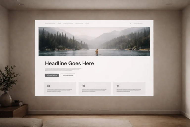
On a landing page, an image is often structural. It sets expectation before a paragraph is read. It signals context. It reduces ambiguity about what is being offered. It supports the headline. If it introduces confusion, it actively damages the page.
On a blog post, an image is usually supportive. It clarifies a point, breaks visual monotony, or reinforces understanding. It does not carry the same burden of persuasion. If it is slightly understated, the article can still succeed.
This is why choosing images for landing pages vs blog posts cannot be reduced to brand consistency alone. The same image may function effectively in one context and weaken another.
The framework outlined in Photography for Websites: How Images Actually Work on a Page explains how images either support structure or act as decoration. That distinction becomes sharper when we examine intent. A decorative image on a landing page is not neutral — it is a missed opportunity to clarify. A persuasive hero image inside an analytical blog post can feel misplaced, even if it is technically strong.
Before debating style, we need to answer a simpler question:
What is this page trying to accomplish?
Only then can we evaluate what the image should be responsible for.
What Landing Page Images Are Responsible For
Landing pages operate under compressed attention.
Visitors arrive with uncertainty. They may not know your brand. They may not fully understand the offer. They are scanning for signals that answer immediate questions:
Is this relevant?
Is this credible?
Is this clear?
In this environment, images are not decorative. They are part of the decision architecture.
A landing page image is responsible for setting expectation before the body copy is read. It communicates context instantly. A product page without a clear product image increases friction. A service page without visual cues about scale, environment, or outcome leaves the visitor to imagine what is being offered.
That gap is where hesitation forms.
Hero images in particular carry disproportionate responsibility. Positioned above the fold, they shape the first impression and frame how the headline is interpreted. As discussed in The Role of Hero Images in Setting Expectation, the hero image is not a background element — it either reinforces the page promise or weakens it.
Clarity is more important than atmosphere.
An abstract, moody photograph may look refined, but if it does not reduce uncertainty, it fails the page. Landing pages require images that narrow interpretation, not widen it. The goal is not to create emotional ambiguity; it is to align perception with offer.
This is also why homepage imagery carries higher risk than most teams realise. As explored in Why Homepage Photos Carry More Risk Than You Think, broad audience entry points amplify visual consequences. When the image is vague, the brand appears vague. When the image is overly generic, the brand appears interchangeable.
The standard for landing pages is therefore stricter than for educational content.
The image must:
- Support the headline directly
- Reduce interpretive guesswork
- Signal professionalism
- Match the promise being made
- Avoid introducing competing narratives
This is where confusion around choosing images for landing pages vs blog posts often begins. Teams reuse blog-style imagery — subtle, documentary, atmospheric — on conversion-focused pages. The result is visually pleasant but strategically weak.
Landing page images carry responsibility for reassurance. They function as evidence, orientation, and framing device. If they are ambiguous, overly artistic, or emotionally detached from the offer, they introduce cognitive work at the exact moment the page should be simplifying decisions.
In practical terms, this means evaluating landing page images through a narrower filter:
Does this image make the offer clearer?
If the answer is not obvious, the image likely belongs elsewhere.
What Blog Post Images Are Responsible For
Blog posts operate under a different rhythm.
They are not compressed decision environments. They are reading environments. Visitors arrive expecting depth, explanation, or analysis. They are willing to scroll. They tolerate nuance. The image does not need to close a decision within seconds.
This shift changes responsibility.
Where landing page images must reduce uncertainty immediately, blog post images must support understanding over time. Their job is not persuasion but reinforcement.
In long-form content, images typically serve one of three roles:
- Clarifying a concept
- Providing context
- Reducing visual fatigue
The first image in a blog post — often referred to as a lead image — introduces tone and orientation. But it does not carry the same burden of reassurance as a landing page hero. It frames the subject matter rather than validating a purchase decision.
Supporting images play an even more specific role. As outlined in Image Types Explained: Choosing the Right Image for the Job, different image types exist for different structural functions. A contextual image may situate a concept in reality. A detail image may isolate an element for emphasis. A narrative image may reinforce a sequence.
Understanding this structure prevents overuse of persuasive imagery inside analytical content.
The distinction between lead and supporting visuals becomes particularly important in educational writing. In Lead Images vs Supporting Images, the separation is made clear: one sets orientation, the others assist comprehension. Confusing those roles results in imbalance.
Because blog posts unfold gradually, images should align with pacing. An overly dominant, sales-driven photograph can distort the tone of an article meant to inform. Conversely, subtle and functional imagery often works better here than it would on a high-stakes landing page.
This is the other half of choosing images for landing pages vs blog posts that teams frequently overlook. They assume higher production value always equals stronger performance. In educational environments, restraint often improves clarity.
A blog post image does not need to prove credibility in the same way a landing page image does. It needs to integrate cleanly into the reading flow. If removing the image does not harm comprehension, it may not be structural enough to justify its presence.
The filter changes from “Does this reassure?” to “Does this clarify?”
When that shift is understood, visual standards become more consistent — not because every page looks the same, but because every image serves its page correctly.
The Common Mistake: Treating All Pages the Same
The most frequent error in website photography is not poor quality. It is uniform thinking.
Teams often establish a visual style and apply it everywhere. The same type of hero image appears on landing pages, blog posts, product pages, and resource sections. The result looks consistent at a glance, but structural differences between pages quietly disappear.
This is where friction begins.
When choosing images for landing pages vs blog posts is treated as a branding exercise rather than a structural decision, page performance becomes inconsistent. A sales page inherits subtle, documentary-style imagery that does not clarify the offer. An educational article adopts bold, emotionally persuasive visuals that introduce unnecessary intensity.
Neither decision is catastrophic. Both are misaligned.
One common pattern is the reuse of highly polished stock photography across informational content. The images are technically strong. They are well-lit, balanced, and commercially appealing. But inside an analytical blog post, they can feel detached from the argument. They appear decorative rather than functional.
The reverse mistake is equally common. Teams adopt a restrained editorial style for blog content and then carry that same restraint onto conversion pages. The result is subtle, atmospheric landing pages that fail to signal confidence or clarity at the moment reassurance is required.
The issue is not taste. It is role confusion.
The broader framework described in Choosing the Right Images: A Practical Decision Framework emphasises that image evaluation should begin with purpose. An image earns its place only when it contributes to the page’s objective. Applying one visual standard indiscriminately ignores that principle.
Consistency should exist at the level of quality and professionalism — not at the level of identical image behaviour.
This is why choosing images for landing pages vs blog posts demands separate filters. The decision criteria change when the outcome changes. Treating all pages as if they operate under the same psychological conditions creates subtle contradictions:
- Pages meant to persuade look hesitant.
- Pages meant to educate look promotional.
- Brands appear visually coherent but strategically confused.
These contradictions rarely trigger obvious alarms. Instead, they accumulate quietly, reducing clarity and increasing interpretive effort.
The solution is not radical redesign. It is disciplined differentiation.
Once teams recognise that page types carry different responsibilities, image selection becomes more precise. Visual standards remain consistent — but application becomes intentional.
And that shift often improves performance without changing a single photograph.
Risk, Trust, and First Impressions
Visual decisions influence trust faster than most teams realise.
Research published by Google on first impressions of websites found that users form aesthetic judgements in as little as 50 milliseconds. The study showed that visual complexity and familiarity strongly influence those early perceptions. Simpler, more prototypical layouts were consistently judged more positively.
That speed matters.
Landing pages operate under compressed attention. Visitors scan quickly and decide quickly. If the visual structure feels complex, ambiguous, or unfamiliar, doubt forms before the headline has time to work.
This is where choosing images for landing pages vs blog posts becomes more than a stylistic preference. It becomes a risk decision.
Blog posts unfold differently. Readers entering an article expect depth. Their judgement evolves as structure and clarity build over time. While imagery still shapes perception, it rarely carries the same immediate conversion pressure.
Landing pages therefore require greater visual precision. The window for interpretation is smaller, and the consequences of mismatch appear earlier.
When teams overlook this, they often assume underperformance stems from messaging or layout. In reality, the image may be subtly undermining credibility before the message has a chance to work.
Understanding this dynamic does not require dramatic redesign. It requires recognising that some pages operate under rapid trust formation, while others operate under sustained engagement.
Images must respect that difference.
A Practical Decision Filter Before You Choose
Once the distinction between page types is clear, image selection becomes less subjective.
Instead of asking whether an image looks strong, the more useful question becomes whether it performs the correct function for the page.
This is where choosing images for landing pages vs blog posts benefits from a structured filter rather than instinct.
Before selecting an image, consider five questions:
1. What is the primary job of this page?
Is it persuading, converting, and reducing uncertainty? Or is it explaining, exploring, and building authority? If the page objective is unclear, image selection will be unclear.
2. Does the image reduce or increase interpretation?
On landing pages, ambiguity is costly. The image should narrow understanding. On blog posts, a little openness may be acceptable if it supports the topic.
3. Is the image structural or decorative?
If removing it would not change comprehension or confidence, it may not be earning its place.
4. Does it match the cognitive speed of the page?
Landing pages operate quickly. Images must communicate immediately. Blog posts unfold gradually, allowing for more subtle reinforcement.
5. Would this image work on a different page type?
If the answer is yes without adjustment, it may be too generic. Strong image decisions are often context-dependent.
This filter shifts evaluation away from style and toward responsibility.
It also reduces the tendency to “fix” weak selection decisions through editing. Adjusting colour, contrast, or cropping does not change whether an image clarifies the offer. As discussed in Editing the Selection, Not the Photo, judgement at the selection stage has far greater impact than refinements made later.
The practical discipline here is simple:
Select based on role.
Refine based on standards.
When those two stages are separated, image decisions become more consistent across a website — not because every page looks identical, but because every image is accountable to its environment.
Why This Difference Quietly Shapes Brand Perception
Visual standards communicate more than aesthetics. They communicate competence.
When images are aligned with page intent, the experience feels coherent. Visitors may not consciously analyse why, but the structure feels deliberate. Pages behave predictably. Messaging and imagery reinforce one another.
When alignment breaks, the effect is subtle but cumulative.
A landing page that feels visually hesitant can make an otherwise strong offer appear uncertain. A blog post that feels visually promotional can distort the tone of thoughtful analysis. Over time, these inconsistencies shape perception. The brand appears less disciplined than it actually is.
This is why choosing images for landing pages vs blog posts is not a minor operational detail. It is a signal of internal clarity.
Consistent standards do not mean identical imagery across all contexts. They mean consistent decision-making logic. Visitors rarely articulate this distinction, but they respond to it. Pages that feel purposeful create confidence. Pages that feel visually interchangeable create doubt.
The difference often has little to do with technical quality. It has to do with whether the image understands its responsibility within the page.
Brands that recognise this do not necessarily produce more dramatic visuals. They produce more appropriate ones.
And that quiet appropriateness compounds.
Conclusion
Images do not exist independently of the pages they appear on.
A landing page asks for clarity, reassurance, and alignment with a specific promise. A blog post asks for reinforcement, pacing, and support for structured thinking. When those environments are treated as interchangeable, image selection becomes inconsistent — even if quality remains high.
The difference is not dramatic. It is operational.
Choosing images for landing pages vs blog posts requires recognising that page intent determines visual responsibility. Once that principle is understood, selection becomes less subjective. The question shifts from “Does this look good?” to “Is this doing the correct job here?”
That shift often improves performance without changing brand style, production budget, or editing approach. It simply clarifies the standard.
Websites rarely fail because their images are technically poor. They weaken when images are misaligned with purpose.
Intent first.
Role second.
Style third.
When that order is respected, visual decisions become quieter — and stronger.
Contribute Thoughtfully
If you work with websites and think carefully about how images function within real pages, we welcome thoughtful contributions.
You can review our submission guidelines here at the Guest Contribution Page