Photography for Websites: How Images Actually Work on a Page
Photography doesn’t “go online” unchanged. The moment an image enters a page, it becomes part of a system — competing with headings, supporting layout, shaping scanning behaviour, and signalling trust. This is a practical breakdown of why good photos fail on websites, and how to choose images that actually do their job.
Photography for websites is often discussed as if it were a subset of photography in general — a matter of taking good photos and placing them online. In practice, it’s a distinct discipline with its own rules, constraints, and failure modes. An image that works perfectly well in isolation can quietly fail once it’s placed on a webpage, not because it’s technically weak, but because it doesn’t align with how websites are read, scanned, and understood.
Web pages are functional environments. They exist to communicate something — an idea, a service, a story, a decision path. Images on those pages are not judged by how impressive they are on their own, but by whether they help that communication happen smoothly. When photography for websites goes wrong, it rarely looks dramatic. Pages don’t break. Images still load. The problem is subtler: the page feels unclear, unfocused, or harder to read than it should be.
This article examines how photography actually works on a webpage — how images interact with text, layout, and intent, and why “good photos” so often fail in real-world use. The goal is not to teach technique or style, but to clarify how images behave once they become part of a page.
Websites are not galleries
One of the most common mistakes in photography for websites is treating pages like galleries. In a gallery, the image is the point. Everything else — the space, the lighting, the sequence — exists to support the photograph. On a website, the relationship is reversed. The photograph exists to support the page.
This difference changes how images should be selected, placed, and evaluated. A photograph that demands attention, invites lingering, or rewards close inspection may be perfect in a gallery context, but problematic on a page whose primary goal is clarity or navigation. When images pull too much attention, they interrupt reading flow rather than supporting it.
Websites require images that cooperate. They need to sit comfortably alongside text, headings, buttons, and navigation without competing for dominance. This doesn’t mean images must be dull or generic. It means their role must be understood and respected.
Images on websites always have a job
Every image on a website performs a function, whether that function was consciously chosen or not. Some images introduce a topic. Others establish tone, signal credibility, or provide visual pacing. Some help the reader understand scale or context. Others simply give the eye a place to rest.
Problems arise when images are added without a clear job in mind. When that happens, images become decorative by default, and decorative images are easy to ignore. If removing an image doesn’t change how a page reads or feels, the image wasn’t doing meaningful work to begin with.
Thinking about photography for websites means thinking in terms of roles, not aesthetics. Before asking whether an image is good, it’s more useful to ask what the image is meant to do on that page, at that point in the layout.
How images influence reading behaviour
Web users don’t read pages line by line. They scan, pause, scroll, and jump. Images play a large role in shaping that movement.
Research from Nielsen Norman Group shows that people typically scan web pages rather than read them word for word, which is why images need to support reading flow instead of interrupting it.
A well-placed image can slow the reader at the right moment, signal a transition, or reinforce the meaning of a section. A poorly placed one can derail attention or create unnecessary friction.
Images affect:
- where the eye goes first
- how long a reader stays on a section
- whether text feels dense or approachable
- how quickly meaning is understood
In photography for websites, success is often measured not by how long someone looks at an image, but by whether the image helps them move through the page smoothly. Images that interrupt reading flow without adding clarity create cognitive noise. Over time, that noise accumulates, making pages feel tiring or unfocused.
This is one reason image selection benefits from a clear decision framework rather than instinct alone. That framework is explored in more detail in Choosing the Right Images: A Practical Decision Framework, which looks at selection as a problem of intent and context rather than taste.
Context outweighs quality
On websites, context almost always matters more than image quality.
A technically average photograph that fits its role can outperform a technically excellent one that doesn’t. This often surprises people, especially those with strong photography backgrounds. But websites are systems. Images don’t exist alone — they interact with surrounding text, page structure, and user expectations.
Some common contextual mismatches include:
- images that suggest a different topic than the text discusses
- images that imply emotion or scale the page doesn’t support
- images that feel promotional in informational content
- images that look personal on institutional pages
None of these images are inherently bad. They are simply misaligned. In photography for websites, misalignment is the most common cause of failure.
Evaluating images in context means reviewing them on the page, not in a media library or lightbox. The question is never “Is this a good photo?” It’s “Does this image support what this page is trying to do?”
Different pages require different image behaviour
Not all website pages ask the same things of images. A homepage, an article, and a service page may all use photography, but the expectations placed on those images are very different.
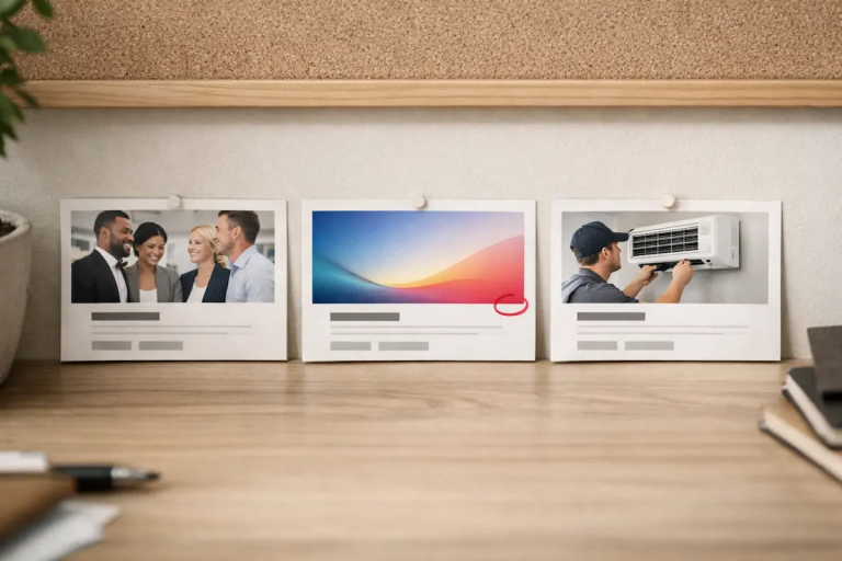
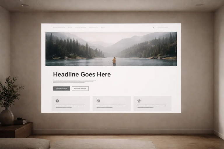
Homepage images often need to:
- establish tone quickly
- signal credibility
- support navigation and hierarchy
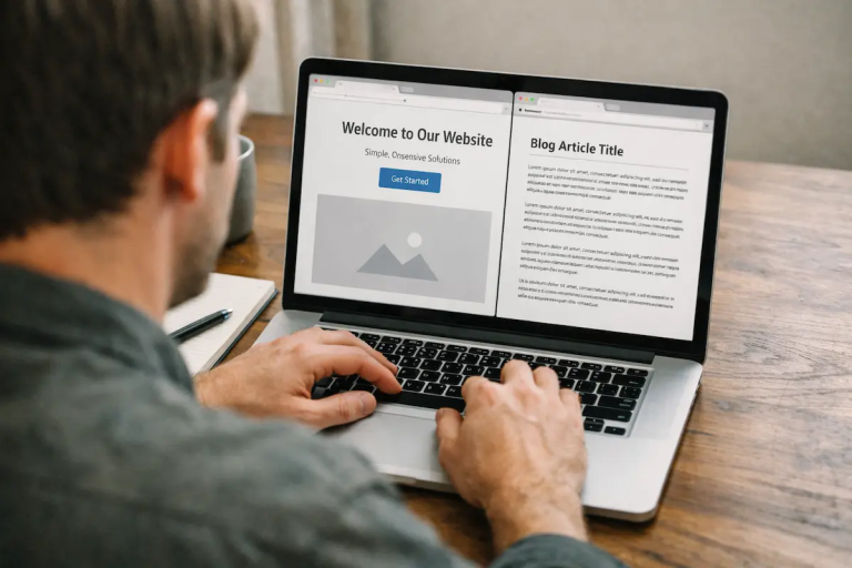
Article images typically need to:
- frame ideas without overwhelming text
- provide pacing and visual relief
- reinforce meaning rather than illustrate literally
Service or product images may need to:
- clarify what’s being offered
- build trust
- reduce uncertainty
Using the same type of image everywhere flattens visual impact and creates confusion. Effective photography for websites adapts image behaviour to page intent.
This is why it’s useful to think in terms of image types and use cases, rather than treating all images as interchangeable. A structured breakdown of these roles is covered in Image Types Explained: Choosing the Right Image for the Job.
For Example: homepage vs article vs service page
A homepage image is judged in seconds. Its job is to set expectation and signal credibility.
An article image is judged in motion. Its job is pacing and reinforcement without derailing reading flow.
A service or product image is judged as evidence. Its job is to reduce uncertainty and clarify what’s being offered.
The same photograph can succeed in one context and fail in another. The difference isn’t quality — it’s role.
More images rarely improve a page
A common assumption in web publishing is that more images increase engagement. In reality, excessive imagery often has the opposite effect.
Too many images can:
- fragment attention
- weaken hierarchy
- compete with each other
- reduce the impact of truly important visuals
When every section has an image, none of them stand out. Visual emphasis disappears, and pages begin to feel cluttered or restless. Readers learn to ignore images altogether.
Photography for websites often benefits from restraint. Fewer images, chosen deliberately, usually create clearer and calmer pages. This is especially true for editorial and informational content, where understanding matters more than spectacle.
Why images fail quietly
Images on websites rarely fail in obvious ways. They don’t break layouts or trigger errors. Instead, they fade into irrelevance.
Quiet failure looks like:
- images that users scroll past without noticing
- images that feel interchangeable
- images that don’t add information
- images that could be removed without affecting meaning
These failures accumulate slowly. Over time, a site can become visually noisy without any single image being obviously wrong.
This is why visual standards matter. Without shared expectations about what images are meant to do, websites drift. Images get added for variety, replaced inconsistently, or reused without context. The result is visual decay — a slow erosion of clarity and coherence.
Why good photos fail on business websites
Good photos fail on business websites when they introduce the wrong expectation, compete with headings and calls to action, or imply a tone the page can’t support. The result is usually not obvious — the page just feels harder to trust, harder to scan, or harder to understand.
You already cover this concept — this just labels it in buyer language.
Consistency builds trust
On websites, consistency often matters more than individual brilliance.
A visually consistent site:
- feels more credible
- reads more smoothly
- is easier to maintain and update
In contrast, a site with wildly varying image styles, tones, and perspectives may showcase strong individual photos, but often feels unstable or incoherent as a whole.
Consistency doesn’t mean sameness. It means shared logic: similar levels of visual complexity, comparable viewpoints, compatible colour treatment, and a coherent sense of tone. Photography for websites works best when images feel like they belong to the same system, even if they’re not identical.
Images should reduce thinking, not increase it
A useful test for website images is simple:
Does this image make the page easier to understand, or harder?
Good images reduce cognitive load. They support comprehension, reinforce meaning, and help the reader orient themselves. Poor images introduce ambiguity, distraction, or unnecessary effort.
If an image requires explanation or justification, it’s probably not doing its job. This doesn’t mean images must be literal or obvious. It means their role should be legible within seconds.
Photography for websites is successful when images feel inevitable — when they seem like the obvious choice once they’re in place.
Photography for websites is a judgement skill
At its core, photography for websites is less about technique and more about judgement.
It involves:
- understanding what a page needs
- recognising how images affect reading behaviour
- matching visuals to intent and context
- knowing when not to use an image at all
These decisions can’t be automated easily. They develop through exposure to real pages, real users, and real outcomes. Over time, patterns emerge. Certain image choices consistently help. Others consistently get ignored.
Learning to see those patterns is what separates functional website photography from decorative imagery.
Those decisions don’t stop at publication. Over time, they compound.
Images change over time, even when nothing else does
One of the least discussed aspects of photography for websites is time.
Images don’t usually fail the moment they’re published. They fail gradually. A photograph that feels appropriate today can feel slightly off six months later, then quietly irrelevant a year after that. Nothing dramatic happens. No one flags an error. The image simply stops contributing.
This happens because websites are not static objects. Content changes, audiences shift, brands evolve, and expectations move on. Images, however, are often treated as fixed assets. Once they’re “good enough,” they’re left in place far longer than the context that justified them.
Photography for websites has to account for this reality. An image choice isn’t just a snapshot decision; it’s a commitment that plays out over time. The more narrowly an image fits a moment, the faster it tends to age.
Websites are visual systems, not collections of images
Another reason images struggle on websites is that they’re often evaluated individually rather than as part of a system.
On a functioning website, photography interacts with:
- typography
- spacing and layout
- colour and contrast
- tone of voice
- page structure
Changing an image without considering those relationships rarely improves a page in a meaningful way. It can even make things worse. A stronger image dropped into a weak system often amplifies imbalance rather than fixing it.
This is why photography for websites works best when image decisions are made with the system in mind, not against it. Images that look understated on their own often perform better because they leave room for the rest of the page to function.
When people say a site “feels messy” or “hard to read,” the issue is rarely one bad image. It’s usually a breakdown in how visuals work together.
The pressure to add images is usually not visual
Many weak image decisions on websites don’t come from visual judgement at all. They come from pressure.
Pressure to:
- fill space
- make pages feel “complete”
- match competitor sites
- justify design choices
This is how pages end up with images that exist simply because an image was expected to be there. Over time, those expectations harden into habits. Every section gets an image. Every article gets a header photo. Every redesign adds more visual weight.
Photography for websites benefits from resisting this pressure. Not every idea needs an image. Not every section benefits from visual emphasis. In some cases, removing an image clarifies the page more than replacing it ever could.
When images become substitutes for clarity
A subtle but common failure mode is using images to compensate for unclear content.
Instead of refining structure, tightening language, or improving hierarchy, an image is added in the hope that it will “help.” Sometimes it does. More often, it masks the problem temporarily while making the page harder to evaluate honestly.
In photography for websites, images work best when they reinforce clarity that already exists. They struggle when they’re asked to create clarity on their own. If a page doesn’t read clearly without images, images are unlikely to fix it.
This is one reason some pages improve dramatically when images are removed. The absence forces attention back onto structure and intent.
Restraint is a long-term advantage
Restraint is not just an aesthetic choice; it’s a maintenance strategy.
Websites that rely on a small number of well-chosen images are easier to update, easier to extend, and easier to keep consistent. They age more gracefully because fewer elements need constant reassessment.
This is where clear image roles matter. When you understand whether an image is meant to introduce, support, or simply pace a page, it becomes easier to decide whether it still earns its place.
Without that clarity, images accumulate. Visual noise increases. And eventually, even strong images get lost in the clutter.
Standards prevent slow visual decay
Most visual decay on websites doesn’t come from neglect. It comes from inconsistency.
Images are added by different people, at different times, under different constraints. Without shared standards, each decision may feel reasonable in isolation, but the overall result drifts. Tone shifts. Complexity increases. The site becomes harder to read visually, even if no single image is obviously wrong.
This is why visual standards matter more than individual taste. Standards don’t need to be rigid or prescriptive, but they need to exist. They provide a reference point for evaluating whether an image still fits the site as it exists now, not as it existed when the image was first chosen.
The long-term impact of standards — and what “good” actually means in practice — is explored in Visual Standards: What “Good” Photography Means in Practice.
Choosing images is an ongoing decision, not a one-time task
A final shift that helps clarify photography for websites is to treat image choice as ongoing rather than final.
Images should be revisited, questioned, and occasionally removed. Not because they’re bad, but because their context has changed. Pages evolve. What they ask of images evolves too.
This perspective aligns closely with a decision-focused approach to image selection. Instead of searching for the perfect image, the goal becomes choosing the most appropriate image for now, knowing that the decision may change later. That mindset is central to Choosing the Right Images: A Practical Decision Framework.
Closing thoughts
Photography for websites is not about finding better photos. It’s about making better decisions.
Images succeed when they support clarity, respect context, and work as part of a larger system. They fail when they’re added out of habit, pressure, or the assumption that more visuals always help.
By thinking in terms of function, restraint, and long-term use, it becomes easier to choose images that genuinely improve a page — and just as importantly, to recognise when an image no longer earns its place.
If you publish or manage images in real-world contexts and would like to contribute or propose a relevant article, see Guest Contributions.
Frequently Asked Questions
1. What makes photography for websites different from regular photography?
Photography for websites isn’t judged in isolation. An image may be technically strong on its own but fail once placed in layout. Website images are evaluated by how well they support clarity, hierarchy, and user flow — not by aesthetic impact alone.
2. Why do good photos fail on websites?
Good photos fail when they don’t match the role the page requires. An image that dominates attention, suggests the wrong tone, or interrupts reading flow can weaken a page even if it’s well shot. Most failures come from misalignment, not poor quality.
3. How many images should a webpage have?
There is no fixed number. The better question is whether each image has a clear job. If removing an image doesn’t change how the page reads or feels, it may not be necessary. Fewer, well-chosen images usually create clearer and calmer pages.
4. Should website images be high quality?
Technical quality matters, but context matters more. A slightly imperfect image that fits the page’s intent often performs better than a polished image that feels out of place. Consistency and role alignment usually outweigh perfection.
5. How do you evaluate whether an image is working on a website?
The most reliable test is to review the image on the page itself. Ask:
Does this image make the page easier to understand, or harder?
If it supports clarity, reinforces hierarchy, and feels inevitable within the layout, it’s likely working. If it distracts or competes, it may need reconsideration.